
BUSINESS
Top 6 Ways to Choose the Right Font and Style for Sign Printing


A poorly chosen font can undo an otherwise well-designed sign, reducing legibility, weakening the message, and leaving viewers uncertain about what they were meant to take away. Typography in signage is a functional decision as much as a creative one, and it affects how quickly and clearly your message lands. Whether you are designing for an outdoor board, a shopfront, or an internal display, these six ways to approach font and style selection will help you get it right from the start.
1. Clarify What the Sign Needs to Do Before Choosing Any Typeface
Every sign serves a purpose, and that purpose should determine the font, not the other way around. Before opening a font library, answer these questions first:
- Is the sign directional, informational, or promotional?
- Will it be read by someone moving quickly or standing still?
- Does it need to match an existing brand identity?
A directional sign needs instant readability at speed. A promotional sign can carry a little more personality. A brand-led sign must connect to the visual identity already in use across other materials. Choosing a font before anchoring that choice in the sign’s function produces signage that looks like a design exercise rather than a communication tool.
2. Legibility Always Comes Before Visual Interest
In sign printing, legibility is non-negotiable. A typeface that looks refined on a business card can become genuinely difficult to read at three metres on a shopfront, particularly in variable lighting or when viewed from an angle.
What Works and What Doesn’t at Scale
- Sans-serif typefaces, clean, without finishing strokes, perform reliably across a range of sizes and environments. They are the default choice for most outdoor and wayfinding applications.
- Serif typefaces demand careful size and generous letter spacing at large scale, but they perform well for brands emphasizing tradition or formality.
- Script and decorative fonts almost always fail at scale. They may look elegant in a presentation but become unreadable when printed large and viewed at distance.
The test is simple: if a viewer has to work to read the sign, the font has failed.
3. Match the Typeface to the Environment the Sign Lives In
When viewed from a moving vehicle, in low light, against a complicated visual background, or outdoors, a font that reads clearly indoors may function very differently. The installation environment must shape the typography decision.
| Environment | Typographic Priority |
| Shopfront at pedestrian level | Medium weight, clear spacing, balanced sizing |
| Roadside or high-speed viewing | Bold weight, maximum contrast, large letterforms |
| Interior wayfinding | Neutral, consistent weight, easy to scan quickly |
| Exhibition or event display | Brand-aligned, adaptable across panel sizes |
| Vehicle graphics | Strong contrast, minimal decorative detail |
Testing the font in a mock-up that reflects the actual installation environment reveals issues that are simply invisible when reviewing artwork on screen.
The 6 Factors That Make Sign Typography Work
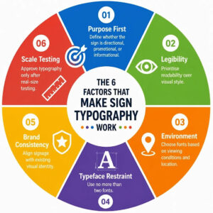
Strong sign typography balances readability, environment, branding, and practical testing rather than relying on visual preference alone.
4. Limit Your Sign to Two Typefaces at Most
Typographic restraint is one of the clearest markers of considered sign design. Using three or more typefaces on a single sign creates visual noise that competes with the message itself.
How to Pair Two Typefaces Effectively
The pairing principle is contrast, not similarity:
- Clean, clear hierarchy with a bold sans-serif heading and a lighter secondary font
- Serif heading + neutral sans-serif body: character with clarity
- Two decorative typefaces together: almost never works
One font for the primary heading, one for supporting information. That is the structure that consistently delivers clear, professional signage results.
5. Ensure Your Font Choice Connects to Your Wider Brand Identity
Signage does not exist in isolation. It is part of a larger visual identity that includes interiors, packaging, digital presence, and printed materials. A font that appears on a sign but bears no relationship to the typeface used elsewhere creates a disconnect that is difficult to explain but immediately felt by anyone familiar with the brand.
Why Consistency Matters More Than Originality Here
Brand typefaces carry recognition, personality, and trust built over time. Where possible, sign printing should extend the same typographic decisions used across other brand touchpoints. When a specific application requires a different choice, the selected font should at minimum share the same tone as the established identity, whether that tone is formal, approachable, bold, or refined.
A sign that looks like it belongs to a different brand is doing the opposite of its job.
6. Always Test at the Intended Scale Before Giving Final Approval
Artwork looks different at actual size. A typeface that appears clean and well-spaced on a small artboard can feel cramped and difficult to read when printed at full sign dimensions. Conversely, a font that looks substantial on screen can appear thin and lightweight on a large-format panel.
Before approving any sign design, request one of the following:
- A physical scaled proof at or near intended dimensions
- A digital mock-up placed into a photograph of the actual installation location
- A full-size section print of the most text-heavy area of the design
This single step catches more problems than any amount of scrutiny on a laptop screen, and it is the step most often skipped when deadlines tighten.
Typography Mistakes That Appear Too Often in Finished Signs
Three errors appear consistently across poorly performing signage and are worth naming directly before any design goes to press:
- All capitals for long phrases: slows reading speed and increases fatigue; works for short words or acronyms only
- Light type on a light background: destroys contrast and makes text invisible in certain lighting conditions
- Too many font sizes without a clear hierarchy: gives the viewer no clear starting point and reduces overall impact
Each is entirely avoidable with a deliberate review of the artwork before production begins. The review takes minutes; correcting a printed sign does not.
Conclusion
Typography is one of the highest-leverage decisions in sign design. Small changes in typeface, weight, and spacing create significant differences in how a sign performs in its real environment. The six approaches covered here are not restrictions on creative thinking, they are the framework within which strong creative decisions are made confidently. Sign Company London brings both design understanding and technical expertise to every project, ensuring that the typography on your signage works as hard as the message it carries.
Author Bio: Nimesh Kerai
Nimesh Kerai serves as the Printing Head at the Sign Company in London. Utilising his technical aptitude and the trait of keeping up with the latest technological advancements, he has been able to deliver top-notch quality prints and signage to sou customers consistently. This has cemented the Sign Company as one of the most sought-after signage companies in London. He consistently shares his insights with the masses by means of useful and intriguing blogs.


If you have searched for webitbgroup com, you are not alone. The domain name surfaces regularly in search results and SEO discussions. Many people want a clear, practical explanation of what it is, how long it has existed, and whether it still functions as a real digital platform.
Webitbgroup com refers to the domain webitbgroup.com. Public records show it was first registered in January 2011 and remains registered through January 2033. That long registration period alone makes it stand out from newer, short-lived sites. Over the years it has been linked to Web IT Business Group Pvt. Limited, a Delhi-based entity associated with web development, IT services, digital marketing, and content publishing.
This guide breaks down the verified facts, past uses, current status questions, and practical takeaways so you can evaluate the domain with clear eyes.
What Is Webitbgroup com?
Webitbgroup com is simply the domain webitbgroup.com. It is not a widely recognized consumer brand with heavy media coverage or large public company filings. Instead, it appears as an older web property that once operated in the space of digital services and online content.
Older third-party listings and professional profiles connect the name to Web IT Business Group Pvt. Limited in Delhi, India. People associated with that group have listed experience in web-related work. Historical site descriptions mention services such as website development, online marketing, and publishing articles or guest posts.
Unlike major tech companies, detailed current corporate information is limited. Ownership details are protected by privacy services, which is common for many domains. This privacy does not automatically mean anything negative, but it does reduce easy public verification.
Key Domain Facts at a Glance
| Detail | Information |
|---|---|
| Domain Name | webitbgroup.com |
| First Registered | January 2011 |
| Current Expiry | January 2033 |
| Linked Entity | Web IT Business Group Pvt. Limited (Delhi references) |
| Primary Past Focus | Web development, IT services, digital marketing, content/guest blogging |
| Ownership Visibility | Protected by privacy services |
These facts come from publicly available domain data and older listings. They give a solid baseline but do not reveal every detail of daily operations.
History and Past Role of Webitbgroup com
The domain has existed for more than 15 years. That age is a positive technical signal because long-standing domains often carry some accumulated search history. However, age alone does not prove ongoing high-quality activity.
In its earlier years, webitbgroup.com appears to have served multiple purposes. It was connected with web and IT service offerings. At the same time, it functioned as a content platform. Guest-post directories listed it as a place accepting articles on topics including technology, business, digital marketing, and general news-style content. Some older references also mention simple web tools, such as utilities built for practical online tasks.
The site previously used a magazine-style WordPress theme suited for news and article publishing. This fits the pattern of many mid-tier content sites that combined service promotion with guest contributions. Such sites can generate traffic and backlinks, which explains why the domain still appears in SEO and guest-post marketplaces.
Traffic data from those marketplaces has typically shown low overall volume, with the majority originating from India. Metrics such as Domain Authority in the low-to-mid 40s have been reported in guest-post listings, though these numbers fluctuate and should be checked with current tools.
Current Status and Activity Questions
Is webitbgroup.com still an active website? The answer is mixed. The domain itself remains registered with nameservers in place and an expiry date years in the future. That means the name is under active ownership control. However, reports from site-checking tools and the difficulty of loading consistent public content suggest the original website may no longer operate in the same form.
A registered domain and a fully functioning public website are different things. Owners sometimes keep domains for future use, redirect them, park them, or let older pages go offline while retaining the name. Some marketplace pages have also noted that the domain could be open to purchase discussions, even while it remains registered.
Because public information is limited, the safest view is that the domain has a documented history, but its current public-facing activity level is unclear. Anyone considering interaction—whether for research, guest posting, services, or domain purchase—should verify live status directly rather than relying solely on older articles.
Evaluating Legitimacy and Trust Signals
When people encounter domains like webitbgroup com in search results, they often want to know if the platform is legitimate. Legitimacy is best judged by multiple factors rather than any single claim.
Positive indicators include the long registration history and the existence of past professional associations. On the other side, limited current transparency, sparse independent reviews, and reliance on SEO-focused blog mentions create weaker signals. Many similar older domains appear in search because content creators write “what is” guides about them. This creates visibility without necessarily reflecting strong organic brand authority.
Trust Factor Comparison
| Factor | Strong Indicators | Weaker Indicators | Notes for Webitbgroup com |
|---|---|---|---|
| Domain Age | 10+ years continuous registration | New or frequently changing | Registered since 2011, expires 2033 |
| Transparency | Clear company details, leadership, contact info | Privacy-protected, limited public records | Ownership privacy-protected; Delhi-linked entity references exist |
| Online Reputation | Independent reviews, media coverage, case studies | Mostly SEO blog mentions, low review volume | Primarily discussed in explanatory articles |
| Technical Presence | Consistent active site, security certificates, recent content | Intermittent availability or outdated pages | Domain active; full site consistency unclear |
| Business Verification | Official filings, LinkedIn company page with activity | Sparse professional confirmation | Individual LinkedIn mentions of related group |
This comparison helps separate technical domain facts from broader business credibility. Readers should apply the same framework to any lesser-known digital platform.
Practical Uses and Considerations
Historically, platforms in this category have been used for a few main purposes. Businesses might have sought web development or digital marketing help. Writers and marketers sometimes pursued guest-posting opportunities for exposure or backlinks. Researchers simply wanted background on the domain name itself.
Today, any of these uses requires fresh confirmation. Guest-post listings from a couple of years ago do not guarantee current acceptance. Service claims from older descriptions may no longer match reality. Domain buyers need to confirm seller legitimacy, transfer process, and any existing content or backlink profile.
One practical example: a digital marketer researching backlink opportunities might find webitbgroup.com listed in a guest-post service. The next step is not immediate purchase of a placement. Instead, check whether the site loads, whether it publishes recent content, what the editorial standards appear to be, and whether the domain still shows consistent metrics in tools like Ahrefs or Moz. If the site is largely inactive, the value of a new link drops significantly.
Pros and Cons of Engaging with Domains Like Webitbgroup com
Pros
- Long domain age can support residual search history.
- Past associations with IT and content work provide a documented context.
- Potential interest for domain investors if the name has commercial appeal.
- Historical guest-post presence may indicate prior content infrastructure.
Cons
- Limited current transparency makes verification harder.
- Unclear activity status reduces confidence for new business or content use.
- Heavy reliance on secondary SEO articles rather than primary brand presence.
- Risk that older metrics or listings no longer reflect reality.
Common Mistakes When Researching Webitbgroup com
People often make a few predictable errors with domains that generate “what is” search traffic.
First, they treat every blog article as official information. Many of these pieces recycle similar details without fresh primary research. Second, they assume a registered domain equals a fully operating company website. Third, they decide on guest-post placements or service inquiries based solely on older marketplace listings. Fourth, they overlook privacy protection and treat the lack of visible ownership as either automatic proof of legitimacy or automatic proof of risk. Neither extreme is accurate.
A better approach is to cross-check domain registration data, attempt to load the live site, look for recent independent mentions, and contact listed addresses only after confirming they still work.
Best Practices for Evaluating Similar Digital Platforms
Follow these steps whenever you research an older domain that appears in SEO contexts:
- Confirm current registration and expiry dates through a reliable WHOIS or RDAP lookup.
- Try loading the main domain and key subpages; note redirects, parking pages, or errors.
- Search for the company name plus “LinkedIn,” “official,” or location terms to find professional profiles.
- Review recent content dates and author information if the site loads.
- Check third-party SEO tools for current traffic estimates and referring domains rather than relying on old screenshots.
- For any financial or content exchange, verify contact methods independently and start with low-commitment tests.
- Treat domain age as one positive data point among many, not the deciding factor.
These habits protect you whether you are a content creator, marketer, researcher, or potential domain buyer.
Conclusion
Webitbgroup com is best understood as a long-registered domain with documented ties to Web IT Business Group and a history spanning web services, digital marketing, and content publishing. Public records confirm its 2011 registration and 2033 expiry, while professional profiles and older listings supply the business and content context. At the same time, limited current transparency and questions about ongoing website activity mean it does not present as a high-visibility, fully documented corporate platform.
Search visibility around the keyword comes largely from explanatory articles rather than broad organic brand demand. That pattern is common for many mid-tier or older digital properties. Readers gain the most value by separating verified domain facts from assumptions about current operations. Whether your interest is research, guest posting, services, or domain acquisition, fresh verification remains the essential next step.
Understanding domains like this also builds better judgment for the wider web. Long registration history is useful, yet it never replaces clear contact details, recent activity, and independent confirmation.
Frequently Asked Questions
What is webitbgroup com?
Webitbgroup com is the domain webitbgroup.com, registered since January 2011 and linked in public records to Web IT Business Group Pvt. Limited. It has historical associations with web development, IT services, digital marketing, and content or guest-blogging activity.
Is webitbgroup.com still active?
The domain remains registered through 2033 with nameservers in place. However, consistent public website availability is unclear according to recent checks, so activity level should be verified directly.
Who owns webitbgroup.com?
Ownership details are protected by standard domain privacy services. Public references connect the name to a Delhi-based Web IT Business Group entity, but full current ownership information is not openly listed.
Is it safe to visit or use webitbgroup.com?
No major public warnings of harm appear in available records. As with any lesser-known site, avoid sharing sensitive personal or financial data until you confirm current operators, HTTPS status, and a clear privacy policy.
Can I still publish a guest post on webitbgroup.com?
Older marketplace listings offered guest-post options, but those do not guarantee current acceptance. Always confirm the site is live, accepting submissions, and meeting your quality standards before proceeding.

If you landed on money6x.com expecting a payout button, you are not alone. Search results still mix old earning-site writeups with newer pages about saving, investing, and property. That mix creates confusion. Money6x.com is a free personal-finance education site. It publishes guides and commentary. It does not hold your cash, place trades, or promise a sixfold return.
The name is branding, not a contract. “6x” points to the idea of growing money through better habits, not a fixed multiple you can withdraw. Treat the site as a reading room. Use what you learn on regulated banks, brokers, and your own budget. This guide walks through what the site is now, what older reviews still claim, and how to use the material without chasing hype.
What Money6x.com Is (and Is Not)
Money6x.com describes itself as a personal-finance education platform. Public coverage of the site points to articles on saving, budgeting, investing basics, real estate, and income ideas. Readers can browse without creating an account or sending payment details.
It is not a bank. It is not a brokerage. It is not a licensed advisory firm handing out personalized recommendations. Nothing on a content site should replace a tax professional, a fiduciary advisor, or the terms of a regulated account.
Older third-party reviews describe a different product. Those writeups talk about surveys, short videos, link shares, app tests, and referral bonuses, with small payouts and a withdrawal threshold. Secondary reports citing the site’s own explainer say those earning and rewards tools were retired, and that mentions of task pay or referral cash tied to the name are outdated. If a page still promises a balance, a USDT payout, or a task panel under this brand, check the exact domain and the date before you trust it.
A clear definition helps featured-snippet readers:
Money6x.com is a free-to-read finance publication covering saving, investing, real estate, and earning strategies. It does not manage deposits or guarantee returns.
Who the content is for
The material fits people building a foundation, not traders hunting a signal service.
- Beginners who want plain-language explainers of budgets and emergency funds
- Side-income readers comparing realistic earning ideas with time cost
- Property-curious readers who want frameworks before they talk to an agent or lender
- Anyone cross-checking viral “multiply your money” claims against basic math
If you already have a written plan, a funded emergency reserve, and accounts at known institutions, the site is optional reading. It will not outperform a boring automatic transfer.
How Money6x.com Fits a Real Money Plan
A useful finance site earns its place when it changes a weekly habit. It fails when it becomes another tab you never act on. Here is a simple way to use money6x.com without treating the brand as a product.
Start with cash flow. A guide is only helpful if you know what comes in, what leaves, and what is left. Then match a topic on the site to a gap you already have. Emergency fund thin? Read savings pieces and set a transfer. Curious about rentals? Read the property explainers, then run numbers with local rents, taxes, and insurance. Looking for extra income? Use strategy articles as a menu, then apply on the actual platforms those methods require.
| Goal | What to read for | What you still do yourself |
|---|---|---|
| Stop overspending | Budget rules, spending categories, savings rate ideas | Track 30 days of transactions in your own sheet or app |
| Build a buffer | Emergency-fund size, where to park cash | Open or fund a high-yield savings account at a real bank |
| Learn markets | Beginner investing explainers, risk and time horizon | Use a regulated broker; ignore any “guaranteed 6x” pitch |
| Study property | Real-estate primers, cash-flow concepts | Verify local prices, loans, and taxes before any offer |
| Add income | Earning-strategy overviews | Apply on reputable job, freelance, or business channels |
That split matters. Reading is step one. Movement of real money happens somewhere else.
A practical weekly routine
Fifteen minutes beats a weekend binge you forget by Monday.
- Pick one article tied to a current gap.
- Write one sentence: what would change if this were true for you.
- Turn that sentence into a single action with a date.
- Skip anything that asks for a deposit, a wallet seed phrase, or an app install from an unofficial link.
Example: an article explains the 50/30/20 split. You earn $3,200 a month after tax. Needs get $1,600, wants get $960, and saving or debt payoff gets $640. You set a $150 automatic transfer this Friday and revisit the wants number in two weeks. The site did not multiply anything. You did, by moving cash before you could spend it.
Money6x.com Then and Now
Search intent around this domain often splits in two. Some people want to know if they can still earn on the site. Others want a legitimacy check after seeing “6x” in the name.
| Topic | Earlier public descriptions | Current picture from site-focused reporting |
|---|---|---|
| Core offer | Micro-tasks, surveys, referrals, small payouts | Articles and guides only |
| Money movement | Reported balances and withdrawal thresholds | No deposit-taking, no live payout panel described |
| Reader cost | Time spent on low-value tasks | Time spent reading |
| Risk shape | Low pay, mixed reviews, referral-heavy claims | Ordinary content-site risk: ads, affiliates, uneven depth |
| Best use | Coffee money at best, if payouts cleared | Idea source and checklist, not an account |
Reported task ranges in older reviews often sat around $0.50 to $5 per activity, with daily totals of a few dollars for a half hour to 90 minutes. Even if those figures were accurate then, they describe a system reviewers say no longer runs. Do not budget around them.
Anyone selling “Money6x trading accounts,” fixed returns, or withdrawal help through chat apps is not describing the education site. Close the chat. Confirm you are on the exact domain before you read further.
Is Money6x.com Legit?
Legit depends on the claim. As a publisher of general finance articles that does not ask for payment information, the current model is an ordinary content business. That is a narrow kind of legitimate. It is not a regulated financial firm, and ownership details are hard to verify from public reviews. A site that takes no deposits needs less trust than a broker. It has also offered less proof of who runs it.
Use three checks before you rely on any page:
- Exact domain match, not a lookalike spelling
- No request for deposits, seed phrases, ID uploads, or remote-access software
- Advice framed as general education, not a personalized promise of returns
Affiliate links and ads are normal on finance blogs. They do not make a site a scam. They do mean a recommendation can be paid. Cross-check rates, fees, and eligibility on the provider’s own page.
Pros and Cons of Using Money6x.com
Pros
- Free to read, with no account required for basic articles
- Covers several personal-finance lanes in one place, from budgets to property concepts
- The “6x” label is best read as a theme, and current reporting says the site does not promise a fixed multiple
- Retired task tools, if accurately disclosed, remove the main way earning-site scams take money
- Useful as a starting outline before you talk to a banker, broker, or agent
Cons
- Not advice, and not accountable for your outcome
- Ownership and editorial standards are not as transparent as a major publisher
- Older reviews still describe payouts, so readers can chase a product that is gone
- The brand name invites hype that basic compounding cannot match on a short timeline
- Depth will vary; a blog post is not a loan estimate or a prospectus
Common Mistakes Readers Make
People waste time on this topic in predictable ways.
Treating the name as a return. Six times your money is a marketing phrase. Doubling invested assets often takes many years at ordinary market rates, and it can also go backward. No article changes that math.
Trusting outdated earning guides. A 2024 or early-2026 review that lists survey pay and referral ladders may describe a retired feature. If you cannot see a live balance and a withdrawal page on the official site, assume you cannot get paid there.
Sending money to a helper. Recovery services, “verification fees,” and wallet-connect prompts are classic traps. A reading site does not need your bank login.
Skipping the local numbers. A real-estate explainer cannot know your city’s taxes, insurance, or vacancy rate. Copying a sample cash-flow table without those inputs produces fiction.
Reading instead of automating. The highest-yield move for most households is still a scheduled transfer and a paid-off high-interest balance. Another tab will not do that for you.
Best Practices for Getting Value from the Site
Keep the site in a support role.
- Pair every article with one measurable action in your own accounts
- Prefer pieces that define terms, show a formula, and list assumptions
- Verify any product mention on the provider’s site and on a second independent source
- Separate net worth goals from income goals so you do not mix investing with side hustles
- Revisit a plan quarterly, not every time a new headline appears
- Teach the same idea to someone else in one paragraph; if you cannot, you do not own it yet
A strong filter is the “deposit test.” If a page, ad, or message connected to the brand asks you to fund an account to unlock earnings, leave. Education does not require a balance.
A simple decision framework
| Question | If yes | If no |
|---|---|---|
| Does the page teach a concept I can apply this week? | Save it and schedule the action | Skip it |
| Does it ask for money, keys, or ID? | Stop and do not proceed | Keep reading with normal skepticism |
| Can I check the claim on a regulated provider’s site? | Compare fees and terms there | Treat the claim as unverified |
| Does the time cost beat a higher-paid use of that hour? | Continue | Switch to work, learning, or rest |
How the “Multiply” Idea Actually Works
People search money6x.com because they want money to grow faster. Growth still comes from a short list of levers. Spend less than you earn. Kill expensive debt. Invest surplus in diversified assets you understand. Raise your earning power. Own productive things, including skills and, for some people, property.
Compounding is slow at the start and louder later. A 7% average annual return does not hand you six times your money in a year. It takes a long holding period, and the average is not a promise for any single year. Property can multiply equity with a mortgage, and it can also multiply losses if rent misses and rates rise. Side income multiplies cash flow only after you count hours, taxes, and tool costs.
Use the site to learn the levers. Use your accounts to pull them.
Conclusion
Money6x.com is best understood as a finance reading site with a loud name and a quieter current job. It can introduce budgets, investing ideas, property concepts, and income strategies. It should not hold your money, and it should not be asked to multiply it on a schedule. Older task-and-referral descriptions belong to a previous version, according to reporting that cites the site’s own update. Read with a specific gap in mind, turn one idea into a dated action, and keep deposits at institutions you can verify. That is the only 6x path that survives contact with a bank statement.
FAQs
What is money6x.com?
Money6x.com is a free personal-finance education website. It publishes general articles on saving, investing, real estate, and earning strategies. It is not a bank, broker, or fund.
Can you still earn money on money6x.com?
Reporting that cites the site’s own explainer says survey, referral, and micro-task payouts were retired. The live offer described now is reading material, not a withdrawal balance. Confirm on the official domain before you rely on any older review.
Is money6x.com a scam?
The current education model does not ask for deposits, which removes the usual earning-site scam mechanism. The brand still has a mixed history, thin public ownership detail, and a name that invites hype. Avoid anyone who requests payment, seed phrases, or remote access under this name.
Does money6x.com give financial advice?
No. Articles are general education. They are not a personalized recommendation, and they are not a substitute for a licensed advisor or tax professional.
How should beginners use the site?
Pick one topic that matches a real gap, such as an emergency fund or a first budget. Write a single action, automate it in your own account, and ignore any claim of guaranteed multiples.

Magazine Luiza, the Brazilian retailer most people know as Magalu, routes staff mail through one corporate domain. If you are trying to reach a buyer, a supplier contact, or an investor-relations desk, the magazineluiza com br email format is the pattern behind those addresses. The domain is magazineluiza.com.br. Public contact databases that index work emails report the same leading structure again and again: first name, a dot, then surname.
That pattern is a strong starting guess, not a company directory. Shares differ by data vendor, and none of those vendors publish an official Magalu naming policy. Use the pattern to draft a candidate address, then verify it before you send anything important.
What the magazineluiza com br email format usually looks like
A corporate address has two parts. The local part sits before the @ sign. The domain sits after it. For Magazine Luiza staff mail, the domain is almost always magazineluiza.com.br.
The local part is where the variation lives. Contact databases such as RocketReach list first.last as the dominant style, at about 88.6% of indexed work addresses. Other vendors put that same pattern even higher, sometimes near the full set of observed personal inboxes. A smaller slice uses the names joined with no separator, a first name alone, or a first initial plus the surname.
Here is a practical reading of the main styles, using a fictional employee so no real inbox is implied.
| Pattern | Sample address | Typical share in public indexes | When it tends to appear |
|---|---|---|---|
| first.last | maria.silva@magazineluiza.com.br | About 87–99%, depending on the vendor | Default for most staff |
| firstlast | mariasilva@magazineluiza.com.br | Roughly 1–7% | Name collisions or older accounts |
| first | maria@magazineluiza.com.br | Roughly 0–4% | Short or unique first names |
| firstinitial.last | m.silva@magazineluiza.com.br | Around 1–2% | Duplicate first-and-last pairs |
| last only | silva@magazineluiza.com.br | Under 1% | Rare leftover style |
| firstinitiallast | msilva@magazineluiza.com.br | Under 1% | Collision fallback |
Treat those percentages as snapshots from third-party indexes, not as Magalu policy. RocketReach, for example, has reported first.last at 88.6%, with firstlast near 6.8% and first name only near 3%. Another index built from thousands of observed addresses puts first.last close to the entire set. The direction is consistent. The exact split is not.
How Brazilian names change the local part
Brazilian naming makes the pattern less mechanical than a Jane Doe example suggests. Accents usually drop. João becomes joao. Ç becomes c. Spaces in compound surnames often disappear or collapse to a single token.
A fictional name such as Ana Luíza dos Santos might become ana.santos, ana.dossantos, or ana.luiza, depending on which token the mail system treats as the surname. Middle names are often skipped. That is why two people with the same public name can land on different local parts, and why a perfect guess still fails.
Personal addresses versus role inboxes
Not every useful address follows a person’s name. Large retailers also keep shared mailboxes for teams. Those role addresses matter more than a guessed staff inbox when you are a supplier, a journalist, or a shareholder.
Public materials from the company have pointed readers toward functional contacts rather than individual employees. Investor relations, ethics reporting, and business or partnership channels are the usual examples. The local part is a department word, not a name: something like ri@magazineluiza.com.br for investor relations. Always copy the address from the current official page, because shared inboxes move.
| Inbox type | Local-part style | Best use | Risk if you guess |
|---|---|---|---|
| Personal work mail | first.last or a close variant | A named buyer, recruiter, or category manager you already know | Bounce, or a message that never reaches the right person |
| Role inbox | Short function word | IR, ethics, press, B2B partnerships | Low, if you take it from the company site |
| Store or regional alias | Location or team code | Local operational issues | High; these are rarely public and change often |
| External partner domain | Not magazineluiza.com.br | Agencies, logistics partners, franchise contacts | You may email the wrong company entirely |
If your goal is a first conversation with the company, start with the role inbox published on magazineluiza.com.br or in a regulatory filing. Guess a personal address only when you already have the person’s name from a reliable source, such as a conference agenda, a signed contract, or their own professional profile.
How to build a candidate address step by step
Start with the name as the person writes it in professional settings, not the nickname on social media.
- Take the given name and the surname they use at work.
- Strip accents and cedillas. Replace spaces with nothing.
- Put a dot between given name and surname.
- Use only lowercase.
- Append @magazineluiza.com.br.
Maria Fernanda Oliveira becomes maria.oliveira@magazineluiza.com.br on the first pass. If that bounces, try mariaoliveira@, then m.oliveira@, then maria@. Stop after a short list. Spraying ten variants at the same company looks like list spam and can get your domain throttled.
A worked example
Suppose you met a category manager named Pedro Henrique Costa at a trade fair, and his badge showed Magazine Luiza. A sensible first candidate is pedro.costa@magazineluiza.com.br. A second is pedro.henrique@magazineluiza.com.br only if Henrique is the name he actually uses. A third is pedrocosta@. You would not invent pedro.h.costa@ unless you have seen that exact style on a Magalu address before. Extra dots and middle initials are uncommon in the public indexes.
How to verify before you send
A pattern match is not delivery. Mail servers accept, reject, or silently drop addresses for reasons you cannot see from the outside.
Practical checks, in order:
- Search the person’s name plus magazineluiza.com.br. Conference pages, press quotes, and patent or filing records sometimes show a real address.
- Compare the domain character by character. Extra letters, a missing “com,” or a swapped country code are common phishing tells.
- Use a proper verification service that checks mailbox existence without sending a full message, if your use case allows it.
- Send one short, relevant note. A bounce is useful data. A non-reply is not proof the address is wrong.
- Watch for a reply from a different domain. Some staff forward corporate mail to a personal inbox and answer from there. The reply domain is the one you should save.
Do not buy scraped “verified” lists and assume they are current. People change teams, leave, and get married. A database refreshed last year can still be wrong today.
Pros and cons of relying on the pattern
Guessing from a known format is normal in B2B outreach. It is also easy to misuse.
Pros:
- You can draft a plausible address in seconds when you already know the person’s name.
- The leading pattern is stable enough that the first guess is often right.
- Role inboxes give you a cleaner path when you do not have a name.
- Knowing the real domain helps you spot fake Magalu mail.
Cons:
- Percentages come from vendors, not from Magalu, so they drift.
- Compound Brazilian surnames break simple first-last rules.
- A correct pattern can still hit a departed employee.
- Unverified bulk mail hurts your sender reputation and can violate anti-spam rules in Brazil and abroad.
- Publishing or trading personal work addresses without a lawful basis raises privacy issues under the LGPD, Brazil’s data protection law.
Use the format as a research aid. Do not treat it as permission to mail thousands of constructed addresses.
Common mistakes
Most failed attempts come from the same handful of errors.
- Copying a competitor’s pattern. American retailers often use first initial plus last name. Magalu’s indexed mail does not.
- Keeping accents. joão.silva@ will not match joao.silva@.
- Using a social handle. A LinkedIn display name is not always the mailbox name.
- Emailing a lookalike domain. magazineluiza.com, magalu.com.br, or a misspelled .com.br address is not the staff domain.
- Assuming one pattern covers contractors, store associates, and corporate staff equally. Store teams and third-party operators often sit on different systems.
- Sending the full pitch to every variant. One relevant note to the best candidate is enough.
- Ignoring role inboxes. A supplier who needs onboarding should not hunt a personal address when a partnerships channel already exists.
Another quiet mistake is treating a format article as a contact list. Patterns describe structure. They do not identify who holds a job this quarter.
Best practices for legitimate outreach
Write to a person only when you have a clear reason they would want the message. A category match, a prior meeting, or a public request for suppliers is a reason. A generic software pitch is not.
Keep the first email short. Name the context in the first line. Offer one next step. Put your own company domain in the signature so the recipient can check you the same way you checked them.
If you run outreach at any volume, verify candidates before the sequence starts. Remove anyone who has left. Honor opt-outs immediately. Log the pattern that actually replied so your team stops guessing on the second touch.
For security on your own side, teach staff what a real Magalu address looks like if you trade with the company. Unexpected payment-detail changes should be confirmed on a known phone number, not by replying to the email that requested the change. Domain familiarity is one of the cheaper controls you have.
What this format does not tell you
The magazineluiza com br email format will not tell you org charts, store phone trees, or who approves a purchase order. It will not confirm that a person still works there. It also will not cover every brand in the wider Magalu group if a subsidiary uses its own domain.
When the stakes are high, use a channel the company controls: the contact form on the corporate site, the investor-relations address in a filing, or a warm introduction. The pattern is a backup for named contacts, not a substitute for those paths.
Conclusion
Most indexed Magazine Luiza work addresses follow first.last@magazineluiza.com.br. Joined names, a bare first name, and an initial-plus-surname cover nearly all of the rest. Role inboxes sit alongside those personal styles and are often the better first stop.
Build one candidate, check the domain, and verify before you send. Brazilian naming quirks and stale databases are the usual reasons a clean-looking address fails. Used carefully, the format saves time. Used as a spray list, it creates bounces, privacy risk, and ignored mail.
FAQs
What is the magazineluiza com br email format?
The usual staff pattern is firstname.lastname@magazineluiza.com.br. Public contact indexes report that style on roughly 87% to nearly all observed personal work addresses. Other styles exist but are uncommon.
What domain does Magazine Luiza use for employee email?
Corporate mail uses @magazineluiza.com.br. Messages from shortened or misspelled domains should be treated as suspicious until you confirm them through an official channel.
How do I email Magazine Luiza if I do not know an employee’s name?
Use a role address published by the company, such as the investor-relations contact in current filings, or the form on the corporate website. Guessing personal inboxes is a weak substitute for those channels.
Why do email-format sites show different percentages?
Each vendor counts a different sample of addresses and refreshes on its own schedule. The leading pattern is stable. The exact share is not official Magalu data, so do not average the figures into a false precision.
Can I trust a constructed Magalu address without checking it?
No. A pattern only suggests the local part. Confirm the domain, verify the mailbox when you can, and send a single relevant message. A bounce or a reply from another domain means you should update your record.
-

 NEWS1 year ago
Historical Churches in Manila
-

 TOPIC3 months ago
Unveiling AvTub: Your Ultimate Guide to the Best AV Content
-

 TOPIC1 year ago
Symbols of Hope: The 15th Belenismo sa Tarlac
-

 TOPIC1 year ago
Simbang Gabi and Kakanin
-

 TOPIC1 year ago
RIZAL at 160: a Filipino Feat in Britain
-

 TOPIC2 months ago
Understanding Fascisterne: Origins and Ideological Roots
-

 NEWS4 months ago
What Caused Delta Flight DL275 to Diverted LAX? A Detailed Breakdown
-

 TOPIC1 year ago
“The Journey Beyond Fashion” – Ditta Sandico