
TOPIC
How Urban Cycling Infrastructure Affects Safety and Liability


What makes one city street safer for cyclists than another? Good cycling infrastructure can separate bikes from fast traffic and reduce sudden conflicts. Protected lanes, clear signs, and safe crossings give riders more room to react.
Poor design can create confusion and increase crash risks. It can also make fault harder to determine after an accident. City planners, drivers, cyclists, and property owners may have different duties.
This guide explains how street design affects safety and liability, offering clear lessons for safer urban travel. Keep on reading!
What Is Urban Cycling Infrastructure?
Urban cycling infrastructure includes all the features designed to make biking safer in cities. These can be marked bike lanes on roads, separate bike paths, or special traffic signals for cyclists.
Some cities also build bike parking areas and repair stations. The purpose is to help cyclists travel easily and avoid heavy traffic. Such infrastructure encourages more people to use bikes for daily trips.
How Infrastructure Improves Cyclist Safety
Good cycling infrastructure can lower the risk of accidents. Protected bike lanes create a barrier between cyclists and cars, which reduces crashes.
Clear signs and painted paths help everyone understand where bikes should go. Cities with better bike lanes often see fewer injuries among cyclists. These safety gains make cycling more appealing for people of all ages.
Cities Making a Difference
Several cities show how better infrastructure helps. In Amsterdam, separated bike lanes have led to fewer serious accidents. New York added protected lanes and saw a drop in bike-related crashes.
Copenhagen’s wide bike paths make cycling a common, safe choice. Melbourne’s new bike lanes also reduced collisions. These examples prove that smart design can save lives.
Expert Insights on Safety and Liability
Experts say that clear lanes and signs help prevent confusion. When road rules are easy to follow, there are fewer arguments after accidents.
Lawyers note that cities with marked bike lanes see fewer lawsuits. Insurance companies often lower rates in cities with safer roads. Urban planners agree that clear design protects both cyclists and drivers.
Understanding Liability After an Accident
Liability means who is legally responsible after a crash. In cities with good bike lanes, it’s easier to decide who made a mistake.
If a driver enters a marked lane, they may be at fault. Cyclists must also follow the rules. Clear infrastructure helps courts and insurance companies figure out what happened.
Challenges and Ongoing Debates
Not every city has the same quality of cycling infrastructure. Some roads still lack safe bike lanes or clear signs. There are debates about where new lanes should go and how wide they should be.
Sometimes, businesses worry about losing parking spaces. A growing concern is that a bike lane injury can raise questions about whether the city did enough to keep people safe. Cities must keep listening to all sides to make the best decisions.
Moving Toward Safer Streets and Shared Responsibility
Urban cycling infrastructure is key to safer roads and fairer outcomes when accidents happen. It helps more people choose bikes for everyday trips.
Clear signs and lanes make it easier to figure out who is responsible after a crash. As cities grow, the need for good design will only increase.
Did you like this guide? Great! Please browse our website for more!

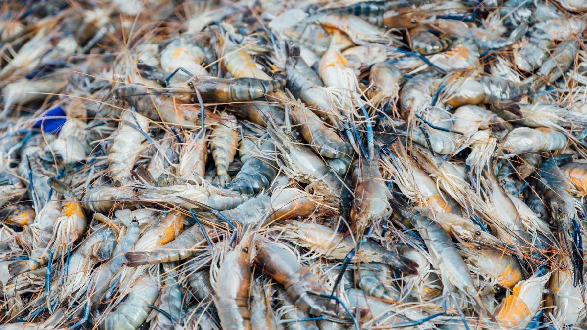
Shrimp from the same species can taste different depending on where they lived and how they were raised. Wild-caught and farmed shrimp differ in diet, water conditions, harvest handling, and often size. Those factors affect sweetness, brininess, firmness, and consistency at the table. Neither label guarantees better quality; freshness and cooking matter too. Knowing how sourcing shapes flavor helps cooks choose shrimp for a dish and judge what they should look for when buying it.
The product listing gives a useful Gulf example: uncooked, shell-on shrimp at a U12–U15 count per pound, identified as Gulf of Mexico catch. It describes a deeper, sweeter profile. Cooks comparing sourcing can use wild-caught fresh shrimp as a reference for larger wild shrimp; count and shell-on format also affect cooking time and portions.
Flavor Depends on Diet and Habitat
Wild shrimp forage on naturally available prey, while farmed shrimp receive controlled feed. Diet, habitat, and species affect flavor, so the sourcing label alone does not predict every bite. Wild shrimp often have a distinct marine sweetness and a brinier taste; farmed shrimp usually have a milder, more even profile. Water conditions and handling also matter. A fresh, well-handled farmed shrimp can taste cleaner than a wild shrimp held warm too long after harvest.
That contrast is easiest to notice in simple preparations. A quick sauté with butter, garlic, or lemon leaves the shrimp’s own flavor in focus, while a heavily seasoned sauce can mask differences. Taste a small batch with minimal seasoning before adjusting salt. Shrimp naturally carry some ocean-derived salinity, so added salt should be measured after cooking rather than added automatically.
Texture Changes With Size and Preparation
Firmness depends on the shrimp’s condition before cooking, its size, and how it is handled. Wild shrimp can have a springy bite, while farmed shrimp often cook to a more consistent texture because their growing conditions are controlled. These are broad tendencies, not guarantees. Freshness, thawing, and cooking time have a direct effect on the final result.
Shells also affect the cooking process. Shell-on shrimp retain moisture and develop flavor as they cook, while peeled shrimp cook faster and need closer attention. Larger shrimp, such as those counted at U12–U15 per pound, require more time than smaller pieces. Cook shrimp just until the flesh turns opaque and firms; continued heat quickly dries the meat and makes it tough.
Check the Sourcing Details
“Wild-caught” identifies how shrimp were harvested, but it does not provide a complete picture of sourcing. The harvest location, species, handling, and time between catch and delivery all matter. A clear origin gives buyers useful context, while details about whether the shrimp arrived fresh or frozen help set expectations for texture and storage.
Farmed shrimp come from managed growing environments, where feed and harvest timing are controlled. Production methods differ, so the label alone does not describe water quality, farm practices, or handling after harvest. Buyers can check the package or ask the seller for the species, country or region of origin, and whether the shrimp was previously frozen. These details support a more meaningful comparison than “wild” or “farmed” alone.
Match the Shrimp to the Dish
For shrimp cocktail or a lightly seasoned sauté, a pronounced sea-sweet flavor can stand on its own. For dishes with a delicate sauce, a milder shrimp can fit without taking over. Shell-on shrimp suit cooking methods that benefit from moisture and shell flavor, though diners need to peel them. Peeled shrimp save preparation time and work well in pasta, tacos, or stir-fries.
Compare shrimp by freshness, size count, shell condition, and intended use. Keep raw shrimp refrigerated and cook it promptly after purchase. If it arrives frozen, thaw it in the refrigerator rather than at room temperature. These handling choices matter for either source and help preserve a clean flavor and pleasant bite.
Conclusion
At the counter or online, choose by intended dish, harvest or farm origin, and handling details rather than the label alone. When preparing a simple sauté or shrimp cocktail, you should compare the freshness, size count, and whether the shells remain on, as these details affect flavor retention, cooking time, and preparation. Ask when the shrimp was harvested or packed if that information is available. Then cook it promptly and avoid overcooking, which quickly turns either type firm and dry.
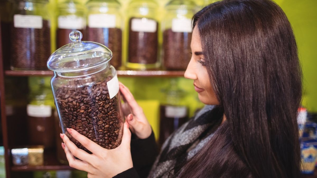
Espresso can taste flat, bitter, or strangely thin even when the grinder and machine seem properly adjusted. The roast date often explains the mismatch. After roasting, coffee beans change as carbon dioxide escapes and oxygen slowly dulls aromatic compounds. Espresso magnifies those changes because pressure extracts flavor quickly. A bag that sat too long before purchase requires different expectations and often produces less satisfying shots. The first step is learning what freshness does inside the puck.
Why Roast Date Changes Espresso
Buyers should check the roast date before judging espresso beans. Coffee loses aromatic compounds during storage, especially after a bag is opened repeatedly. A page listing espresso coffee beans for sale can help shoppers compare options, yet the roast date still determines how fresh those beans are at delivery. That check prevents stale coffee from being blamed on the machine or recipe.
Freshly roasted beans contain carbon dioxide created during roasting. During degassing, the gas escapes, which affects how water moves through the coffee puck. Beans used immediately after roasting often produce unstable shots because excess gas disrupts extraction.
Older beans lose gas and aroma as storage continues. Oxygen also reacts with coffee oils, reducing the flavors that create sweetness, fruit notes, chocolate character, and a clean finish. The result often tastes dull, hollow, or harsh.
Finding The Right Brewing Window
Espresso usually needs a short rest after roasting. Many coffees produce more balanced shots after several days of degassing, while darker roasts often release gas faster than lighter roasts.
A practical starting point is to brew a fresh bag after it has rested for several days. The ideal window depends on the coffee, roast level, packaging, and storage conditions. The roast date gives the buyer a reference for testing that window.
A bag without a clear roast date creates unnecessary guesswork. A “best by” date indicates shelf life, not how long it’s been since roasting. For espresso, knowing the actual roast date makes dialing in more precise.
Signs The Beans Are Too Old
Stale espresso often runs faster than expected, even after you grind finer. The shot can look pale, lack crema, and taste thin despite a normal dose and brew time.
Flavor provides another clear clue. Flat bitterness, papery notes, and a weak aroma often point to oxidation. These signs differ from under-extraction, which usually creates sharp acidity and a short, sour finish.
Crema alone cannot confirm freshness. Darker roasts can produce more crema because they contain more surface oils, while some fresh light roasts produce less. Taste, flow rate, and aroma provide better evidence together.
How Storage Affects Freshness
Heat, light, moisture, and oxygen all speed up the loss of quality. Store beans in an airtight container away from sunlight, steam, and the heat produced by an espresso machine.
Buy a quantity that suits the household’s brewing schedule. A large bag opened over several months gets repeatedly exposed to oxygen, even when you close the container between uses. Smaller purchases keep the later doses closer to the original flavor.
Grinding also changes the equation. Ground coffee exposes far more surface area to oxygen than whole beans, so grinding immediately before brewing preserves more aroma. A consistent grinder then makes recipe adjustments easier to interpret.
Dialing In A Fresher Bag
Start with the same dose, yield, and brew time used for the previous coffee. Change one variable at a time, beginning with the grind size. A fresh bag often needs a different setting because gas content changes how water flows through the puck.
If the shot runs quickly and tastes weak, grind finer. If the shot runs slowly and tastes bitter or dry, a coarser grind will help. Keep notes about the roast date, grind setting, dose, yield, and taste.
Those notes show whether the coffee improves with more rest. They also separate bean age from problems involving distribution, tamping, water temperature, or machine performance.
Conclusion
Freshness deserves a place beside grind size, dose, and water temperature in every espresso routine. The roast date gives the clearest starting point because it shows how long the beans have been changing before brewing. Buyers should record that date, store the bag sealed, and adjust the grind as the coffee ages. If shots stay dull despite careful dialing, purchase a fresher bag and compare the result. That simple test separates bean age from equipment problems.
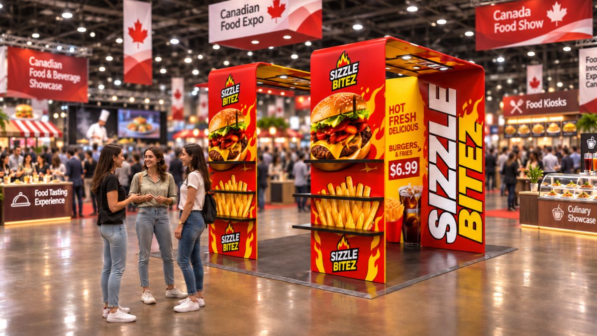
Exhibiting for the first time can feel like a bigger investment than expected. Between booth space, printed graphics, furniture, transportation, and promotional materials, even a small display requires careful planning. Yet a professional-looking booth does not necessarily need expensive construction or a large footprint.
The difference often comes down to how well the available space is used. A clear message, coordinated branding, thoughtful product placement, and an organized layout can make a basic booth feel intentional and inviting. For first-time exhibitors, the goal is not to fill every corner but to make every element serve a purpose.
1. Start With One Clear Booth Message
Before ordering displays or printing graphics, decide what visitors should understand about your business within a few seconds. Trying to introduce every product, service, and company achievement at once can make a small booth difficult to understand.
Choose one main message that communicates what you offer or why someone should stop.
For example, a skincare brand might use “Discover Your Everyday Skincare Routine,” while a technology company could highlight a specific solution or product benefit. Place this message prominently on the backwall, supported by your company name and logo.
A useful test is to show the proposed design to someone unfamiliar with your business. If they cannot explain what you offer after a quick look, simplify the message before sending the artwork for printing.
2. Use Vertical Space Instead of Adding More Furniture
One of the most common mistakes first-time exhibitors make is trying to display everything at table level. Product boxes, brochures, samples, and promotional items quickly consume the available surface, leaving little room for visitors to interact.
Use the height of the booth instead.
A fabric backdrop or portable banner can carry your main branding, while a smaller display stand can highlight a product or service. This creates visual interest without taking up valuable floor space.
For a compact 10 × 10 booth, consider this arrangement:
- Back: A branded backdrop with your primary message.
- One side: A vertical banner or product information display.
- Center or side: A table for demonstrations, samples, or conversations.
- Under the table: Hidden storage for extra materials and personal belongings.
Keep the entrance open. Visitors should feel that they can step into the booth without having to navigate around furniture.
3. Make Your Table Part of the Branding
A plain or cluttered table can make an otherwise attractive booth look unfinished. Since tables often occupy a prominent position in smaller exhibit spaces, their appearance deserves attention.
A branded table cloth can bring the company’s colors and logo into the lower portion of the display while covering storage underneath. Choose a design that complements the backdrop rather than introducing another visual theme.
Another option is to use Custom Table Runners over a clean table covering. A runner can add branding without requiring a fully printed tablecloth, making it useful when exhibitors want a simpler or more adaptable setup.
Pay attention to logo placement. A design positioned on the front-facing section is generally more useful than one hidden beneath products or brochures.
4. Display Fewer Products, but Present Them Better
A small booth rarely has enough room to showcase an entire product range. Attempting to do so can make the display feel crowded and prevent visitors from identifying the most important items.
Instead, select two or three products that best represent your business. These might include a bestseller, a new release, and a product that demonstrates a unique feature.
Give each item enough room to be seen. Use small risers, shelves, or display blocks to create different heights rather than arranging everything in a single row. Add concise product labels explaining one important benefit or feature.
If visitors want to explore the full range, provide a QR code linking to your digital catalogue. This keeps detailed information accessible without turning the booth into a storage area for printed brochures.
5. Use Lighting to Highlight Important Details
Exhibition halls often have uniform overhead lighting, which can make smaller displays blend into their surroundings. A carefully positioned light can help draw attention to a particular product, graphic, or demonstration area.
Rather than illuminating everything equally, focus on the feature you want visitors to notice first. For example, a spotlight can highlight a product sample, while a light directed toward the backdrop can improve the visibility of important graphics.
Before arranging additional lighting, check the venue’s electrical requirements and restrictions. Also test the setup from the aisle to make sure lights do not create glare on screens or reflective surfaces.
6. Keep Colors, Materials, and Graphics Consistent
Professional presentation depends on visual consistency. When banners, table coverings, brochures, and promotional materials use unrelated colors and styles, the booth can look assembled rather than designed.
Start with your existing brand guidelines. Use the same logo, primary colors, and typography across the display. If your branding includes several colors, select only the most recognizable ones for the booth.
Check printed artwork before production. Low-resolution logos, stretched images, inconsistent colors, and spelling mistakes can undermine an otherwise well-planned display.
It is also worth requesting a digital mockup of the complete booth arrangement. Reviewing the backdrop, table covering, and banners together makes it easier to identify design conflicts before anything is printed.
7. Prepare for the Practical Details
A professional booth must work throughout the event, not just look good before visitors arrive. First-time exhibitors should prepare for the small problems that can interrupt setup or make the space look untidy.
Pack a basic booth kit containing:
- Tape, scissors, cable ties, and cleaning cloths.
- Extension cords and approved power accessories, if needed.
- Extra business cards and promotional materials.
- A printed setup diagram and product information.
- Packaging or containers for storing spare items.
Confirm the venue’s booth dimensions, height restrictions, setup schedule, electrical access, and installation rules before the event. Arriving with displays that do not fit the allocated space can create unnecessary last-minute changes.
Final Thoughts
A small booth can make a strong impression when its design is focused and its layout is organized. First-time exhibitors should prioritize a clear message, vertical displays, coordinated branding, selective product presentation, and practical setup arrangements rather than spending on unnecessary decoration.
The most professional booth is not necessarily the largest or most elaborate. It is the one where visitors can quickly understand the business, see what makes it worth their attention, and comfortably start a conversation.
-

 NEWS1 year ago
Historical Churches in Manila
-

 TOPIC4 months ago
Unveiling AvTub: Your Ultimate Guide to the Best AV Content
-

 TOPIC1 year ago
Simbang Gabi and Kakanin
-

 TOPIC1 year ago
Symbols of Hope: The 15th Belenismo sa Tarlac
-

 TOPIC1 year ago
RIZAL at 160: a Filipino Feat in Britain
-

 NEWS5 months ago
What Caused Delta Flight DL275 to Diverted LAX? A Detailed Breakdown
-

 BUSINESS6 months ago
Exploring the Different Types of Понуде in Business Transactions
-

 TOPIC3 months ago
Understanding Fascisterne: Origins and Ideological Roots