
TECHNOLOGY
Designing for Privacy: Best UX Practices for Security-Focused Web Applications


Privacy used to be a checkbox buried in a footer link. Nobody read it. Today, it’s a core part of how people decide whether to trust a product at all. A confusing consent screen or a vague data policy can cost a business real users, not just goodwill.
Good privacy design isn’t only about encryption or legal compliance. It’s about how information is presented, how choices are framed, and whether the interface respects the person using it. Below is a practical look at what that actually means for teams building security-focused web applications.
Why Privacy Has Become a Design Requirement
Surveys consistently show that most internet users worry about how their data is collected and used. One widely cited Pew Research study found that roughly 67% of Americans are concerned about how companies handle their personal information, and a similar share feel they have little control over it. That’s not a niche anxiety anymore. It’s mainstream.
For designers, this changes the brief. Privacy can no longer sit at the bottom of the priority list, addressed only after the “real” features are done. It has to shape decisions from the first wireframe, because users are actively looking for signals that a product takes their data seriously.
Build Data Minimization Into Every Screen
The simplest privacy principle is also the easiest to ignore: don’t ask for what you don’t need. Every extra form field, every optional-but-requested phone number, every “just in case” data point adds friction and raises suspicion. Fewer fields usually mean higher conversion, too, so this isn’t purely an ethics argument.
Designers should treat each data request as a cost. Ask: does this feature genuinely require this information right now, or could it be requested later, only when it’s actually necessary? Progressive disclosure — collecting data gradually as trust builds — tends to work better than front-loading a long signup form.
Give Users Real Control Over Their Own Connection
Server-side protection only covers half the picture. Applications that take privacy seriously also point users toward tools that secure their connection, especially on public networks. This is one reason many security-conscious platforms now recommend pairing account-level protections with a dedicated VPN. One of the significant advantages of this type of service is its support for all platforms, offering applications for Windows, smart TVs, and browser extensions. You can visit this site to see how mobile integration works in practice. This doesn’t eliminate the need for server-side efforts, but it helps protect against potential leaks and the emergence of hidden spots where it’s impossible to monitor and ensure security.
That kind of guidance matters more than it might seem. A person connecting from an airport Wi-Fi network is far more exposed than one on a home router, and most interfaces never mention this at all.
Make Consent Requests Honest
Pre-checked boxes, tiny “reject all” links, and consent banners designed to be annoying until you click “accept everything” are dark patterns. They might boost short-term metrics. They also erode trust fast, and regulators in several regions are increasingly penalizing them.
A better approach treats consent as a real choice, not an obstacle course:
- Present “accept” and “reject” options with equal visual weight
- Explain, in plain language, what each data category is used for
- Avoid pre-selecting anything the user hasn’t actively chosen
- Make it just as easy to withdraw consent later as it was to give it
None of this is complicated. It just requires resisting the temptation to nudge users toward “yes.”
Use Visual Signals Users Actually Trust
Lock icons, “secure” badges, and https indicators became so common that many users stopped noticing them. What tends to work better now is specific, plain-language reassurance placed exactly where anxiety spikes — right before a payment field, for instance, or next to a request for a government ID.
Instead of a generic shield icon, a short sentence like “We never store your card number” does more work. Specificity builds credibility. Vague symbols, no matter how polished, don’t.
Avoid Dark Patterns in Privacy Settings
Privacy settings buried three menus deep, toggles that reset after every update, or wording so ambiguous nobody’s sure what they’re agreeing to — these all count as failures, even if the backend is technically compliant. As one UX researcher put it during a recent industry panel, “Privacy that users can’t find is privacy that doesn’t exist for them.”
Settings should be searchable, grouped logically, and described in short, direct sentences. If a setting affects data sharing with third parties, say so explicitly rather than hiding it behind generic phrasing like “personalization preferences.”
Small Interface Details That Build Confidence
Sometimes trust comes down to details that seem minor. A visible last-login timestamp. A one-click way to download or delete all stored data. Even the tools a company recommends can signal how seriously it treats privacy. Pointing users to a lightweight option like the Chrome extension, for example, shows that browsing protection is something the product actively cares about, not just a checkbox in the privacy policy. Security is something that builds from small bricks and grows into an impenetrable wall.
These small additions rarely show up in a feature list, but they’re often what users remember when deciding whether to keep using an app or delete their account entirely.
Test With Real Users, Not Just Compliance Checklists
Legal review confirms a product meets regulatory requirements. It doesn’t confirm that a real person understands what they’re agreeing to. Usability testing focused specifically on privacy flows — consent screens, data export tools, account deletion — often reveals confusion that a compliance audit would never catch.
Even a handful of five-person test sessions can expose where language is unclear or where a “delete my account” button quietly doesn’t delete everything. That gap between legal compliance and actual user understanding is where most privacy-related frustration lives.
Final Thoughts
Privacy-focused UX isn’t a single feature you bolt onto a finished product. It’s a set of small, consistent decisions: what you ask for, how you phrase consent, what tools you recommend, and how honestly you present risk. None of these choices are flashy. Together, though, they’re often what separates a product users trust from one they quietly abandon.


Have you ever come across the phrase ponas robotas and wondered what it actually means? The term comes from Lithuanian and translates directly to “Mr. Robot.” People use it today to talk about intelligent robotic assistants that feel more approachable and capable than traditional machines. These systems handle everyday tasks while adapting to the people around them.
The idea mixes cultural references with real technology. It highlights how robots are moving out of factories and into homes, hospitals, and offices. Understanding ponas robotas helps you see where personal robotics is heading and what practical value it already delivers.
What Does Ponas Robotas Mean?
Ponas robotas literally means “Mr. Robot.” “Ponas” is the polite Lithuanian title for a man, similar to “Mr.” or “Sir,” while “robotas” simply means robot. Combining them gives a machine a respectful, almost human title.
In practice, the phrase now describes smart robots and AI-powered assistants that interact naturally with people. These are not purely industrial arms repeating the same motion thousands of times. Instead, they sense their surroundings, respond to voice or gestures, and adjust their behavior based on routines.
You will hear the term in discussions about home helpers, care robots, and collaborative workplace systems. It signals a shift toward machines that support rather than simply replace human effort.
The Cultural Roots Behind the Term
The phrase gained wider recognition through the popular television series Mr. Robot. In Lithuanian-speaking regions the show was known as Ponas Robotas. The series explored technology, privacy, and the influence of digital systems on ordinary people, which helped the words stick in public conversation.
That cultural link still matters. When people say ponas robotas, they often blend the polite linguistic title with modern ideas of capable, context-aware machines. The result feels less like cold automation and more like a helpful presence.
This background also explains why the term appears in both casual talk and technical writing. It carries a sense of personality without claiming the robot is truly human.
Core Technologies Powering These Systems
Modern systems described as ponas robotas rely on several connected technologies. Sensors let them see and navigate. Onboard processors run models that interpret speech and movement. Connectivity allows updates and coordination with other smart devices.
Typical components include:
- Vision and depth cameras for object recognition and safe movement
- Microphones and speech models for natural conversation
- Touch or force sensors that prevent accidents during physical interaction
- Adaptive software that learns preferred routines over time
These pieces work together so the robot can move through a home, respond to a request, and improve its performance without constant reprogramming.
| Feature | Traditional Industrial Robots | Ponas Robotas-Style Assistants |
|---|---|---|
| Primary Setting | Factories and warehouses | Homes, hospitals, offices |
| Interaction Style | Fixed programs, limited human contact | Voice, gesture, and adaptive responses |
| Learning Ability | Minimal or none | Improves from daily use and feedback |
| Safety Approach | Physical barriers or cages | Built-in sensors and soft-collision design |
| Typical Tasks | Welding, assembly, heavy lifting | Cleaning, reminders, monitoring, light assistance |
This comparison shows why the newer systems feel different in everyday settings. They prioritize safe, flexible help over raw speed or strength.
Real-World Applications of Ponas Robotas Systems
These assistants already appear in multiple environments. In homes they manage schedules, control lighting, vacuum floors, or remind someone about medication. In healthcare they support nurses by delivering supplies or helping patients with basic mobility. Warehouses use related mobile robots for navigation and item transport.
Here are practical examples:
- A household unit that greets you, checks the weather, and starts the coffee maker based on your usual morning routine
- A hospital robot that carries linens and alerts staff if a patient requests help
- A classroom companion that answers basic questions and keeps younger students engaged during group activities
| Setting | Common Tasks | Main Benefit |
|---|---|---|
| Home | Cleaning, reminders, device control | More free time and consistent routines |
| Healthcare | Supply delivery, patient monitoring support | Reduced staff workload and faster response |
| Education | Tutoring support, interactive lessons | Personalized attention for learners |
| Logistics | Inventory movement, sorting assistance | Faster fulfillment with fewer errors |
| Hospitality | Guest guidance, room service support | Consistent service without fatigue |
Each use case focuses on repetitive or physically demanding work so people can concentrate on judgment, creativity, or direct care.
Pros and Cons of Ponas Robotas Assistants
These systems offer clear advantages, yet they also introduce trade-offs you should consider before adopting them.
Pros
- They free up time by handling routine chores reliably.
- Adaptive learning means performance improves with regular use.
- Consistent availability helps with monitoring or reminders that people might forget.
- Many designs include safety features that reduce the risk of accidents in shared spaces.
Cons
- Higher upfront cost compared with basic appliances or simple software tools.
- Dependence on connectivity can limit function during outages.
- Privacy questions arise when cameras and microphones stay active.
- Maintenance and occasional software updates require attention.
Most households and workplaces find the time savings worthwhile once the system is set up properly. Still, the privacy and cost factors deserve careful review.
Common Mistakes When Adopting These Systems
People sometimes expect perfect performance from day one. These assistants need a short learning period to match routines accurately. Skipping that setup leads to frustration.
Another frequent error is placing the robot in cluttered or poorly lit areas. Sensors work best with clear pathways and adequate lighting. Ignoring basic placement reduces reliability.
Some users also overlook regular software updates. Outdated systems miss improvements in navigation or speech recognition. Setting a simple monthly check prevents most issues.
Finally, treating the machine as fully independent without any oversight can create problems. Human review still matters for sensitive tasks such as medication reminders or security alerts.
Best Practices for Getting the Most Value
Start with clear goals. Decide which two or three tasks matter most, then configure the system around them. This focused approach produces faster results than trying to automate everything at once.
Keep pathways open and consistent. Mark preferred routes if the robot supports custom maps. Good physical organization improves performance more than any software tweak.
Review privacy settings early. Limit data sharing to essential functions and check what information stays on the device versus the cloud. Many models let you adjust these options without losing core features.
Schedule short weekly reviews. Note any missed tasks or odd behavior, then adjust preferences. Small corrections compound quickly and keep the assistant aligned with real needs.
Combine the robot with existing tools rather than replacing everything. Link it to your calendar or smart lights so the systems reinforce each other. This integration multiplies convenience without extra complexity.
Conclusion
Ponas robotas captures both a simple linguistic idea and a broader shift in robotics. The polite title reflects how people want machines that feel approachable and useful rather than purely mechanical. From household helpers to hospital support tools, these systems already handle practical work and continue to improve.
The key is matching expectations with real capabilities. Focus on clear tasks, maintain the hardware and software, and stay aware of privacy settings. When you do, the assistant becomes a steady part of daily routines instead of a novelty. As the technology matures, the helpful presence suggested by the original Lithuanian phrase will likely become even more common in homes and workplaces.
Frequently Asked Questions
What does ponas robotas mean in English?
It means “Mr. Robot.” The phrase comes from Lithuanian and is now used to describe intelligent robotic assistants that interact with people in everyday settings.
Is ponas robotas a specific product or brand?
No single product owns the name. The term refers more broadly to modern personal and collaborative robots that emphasize safe, adaptive help.
How does a typical ponas robotas system learn routines?
It observes repeated actions, records preferences you set, and refines its responses over days or weeks of normal use. Most models also accept direct voice or app adjustments.
Are these systems safe around children or pets?
Most consumer and care models include collision detection, soft edges, and speed limits. Proper placement and supervision still matter, especially during the first weeks.
What is the usual price range for household versions?
Basic models often start a few hundred dollars, while more advanced units with stronger navigation and interaction features range from roughly one to two thousand dollars depending on features and manufacturer.

Mobile monetization works best when it is treated as part of the product experience, not as a separate revenue layer added after launch. Publishers exploring monetization strategies for mobile apps should begin with a simple principle: an ad system must support the value users expect from the app while creating reliable opportunities for advertisers and revenue for the business.
A higher short-term revenue figure is not automatically a sign of a healthier app. If ads slow down key screens, interrupt tasks, create accidental taps, or make users feel pressured, the result can be lower retention, weaker ratings, and more support requests. A durable strategy reviews revenue, experience, performance, privacy, and ad quality together.
Why Monetization Needs A Health Check
Ad monetization is a system with connected parts. A change that raises effective CPM may also reduce session length or increase uninstall rates. Similarly, a new demand source may improve fill rate while introducing creatives that do not fit the audience. Reviewing only one dashboard can hide these trade-offs.
A practical health check asks whether users can still easily complete their main task, whether ads are appropriate for the app’s audience, whether the app remains stable, and whether revenue is improving without harming longer-term engagement. This balanced view gives product, engineering, and monetization teams a shared way to make decisions.
Build Monetization Around User Value
Users are more likely to accept advertising when the exchange is understandable. In a game, a rewarded ad may offer an extra life, optional currency, or a bonus. In a utility app, advertising may help support free access to a useful service. The key is clarity: users should know what they receive and what action they are choosing.
Map Ads To The User Journey
- Onboarding: Keep early sessions focused on demonstrating the app’s value.
- Active use: Avoid interruptions during focused, time-sensitive, or high-consequence actions.
- Natural pauses: Consider ads between completed tasks, levels, articles, or content segments.
- Return visits: Adjust exposure based on how frequently a person uses the app.
Before adding a placement, ask three questions: What does the user receive in return? Does this placement support or interrupt the app’s purpose? Can the user understand why the ad appeared at that moment?
Review The Main Revenue Models
There is no universal revenue model. The strongest choice depends on the app’s purpose, audience, frequency of use, and the type of value it delivers.
- Advertising: Often suits free apps with regular engagement. Its main risk is ad fatigue or a disruptive experience.
- Subscriptions: Can fit apps that deliver ongoing content, services, or regularly updated features. The key measure is whether users continue to see recurring value.
- In-app purchases: Can work for optional upgrades, digital goods, premium features, and game content. Clear pricing and a useful purchase benefit matter.
- Hybrid monetization: Combines approaches, such as offering an ad-supported free tier and an ad-free subscription. It can serve different user preferences, but the paths must remain easy to understand.
- Sponsored experiences: Can be useful when the sponsor, offer, and audience are naturally aligned.
Improve Ad Placement And Timing
Formats should match the moment. Banners can provide persistent but limited visibility; native placements can fit within content when clearly identified; interstitials need natural breaks; and rewarded ads should follow an explicit user choice. Google Play’s ad experience requirements reinforce the importance of avoiding unexpected, deceptive, and disruptive placements.
Useful Placement Rules
- Show rewarded ads only after the user opts in.
- Use interstitials after a completed activity, not before the intended action takes effect.
- Keep banners away from navigation, checkout controls, and other frequently tapped elements.
- Pause advertising during account creation, payment flows, emergency use cases, and other sensitive actions.
- Apply frequency caps so the same person is not repeatedly interrupted in a short period.
Protect App Performance
An ad that arrives too late, renders incorrectly, drains battery life, or contributes to a crash can cost more than the impression earns. Monitor ad requests separately from the rest of the app so teams can identify whether delays occur in the network request, mediation process, creative load, or rendering step.
- Measure time from ad request to visible render.
- Track failed, timed-out, and abandoned ad loads.
- Test on older devices, smaller screens, mobile data, and weaker connections.
- Review layout shifts, blank placements, accidental taps, crash reports, and battery impact after major changes.
Use Privacy-First Measurement
Measurement should collect only the information needed to operate, evaluate, and improve the monetization system. Teams should document what data is collected, why it is needed, how long it is retained, and which partners or internal roles can access it. The FTC advises businesses to collect only what they need, safeguard it, and dispose of it securely, as outlined in its privacy and security guidance.
Clear consent language, accurate privacy notices, data minimization, and sensible retention limits are practical foundations. Contextual signals and first-party insights can also help publishers understand broad usage patterns without treating every user interaction as a reason to gather more data.
Create A Practical Testing Plan
- Choose one goal. Focus on revenue, retention, load speed, or satisfaction.
- Change one variable. Test a format, placement, frequency cap, timing rule, or reward size.
- Define the audience. Start with a limited, clearly identified traffic segment.
- Set a realistic window. Include enough normal usage to avoid reacting to a brief spike or dip.
- Review side effects. Compare revenue with retention, session behavior, complaints, and technical performance.
- Roll out gradually. Expand only when the overall result remains positive.
Track The Right Metrics
Revenue metrics matter, but they should be interpreted alongside experience and quality signals. A useful measurement set includes:
- Revenue: revenue per active user, revenue per session, effective CPM, fill rate, and ad request success rate.
- User experience: Day 1, Day 7, and Day 30 retention, session length, app rating trends, ad abandonment, and support complaints.
- Quality control: ad load time, crash rate, creative rejection rate, invalid traffic signals, and repeat exposure per user.
Common Mistakes To Avoid
- Choosing the highest immediate revenue option without checking retention or reviews.
- Launching several new formats at once, making it impossible to identify the cause of a result.
- Ignoring users on lower-end devices or weaker networks.
- Using vague privacy language or collecting data without a clear operational need.
- Measuring clicks without investigating accidental interactions.
- Copying another app’s placement strategy without considering the audience and product flow.
Conclusion
Healthy monetization is a long-term product decision. The best systems create revenue while preserving speed, privacy, trust, and the core reason people use the app. By matching ads to user value, carefully testing changes, protecting performance, and evaluating results with a balanced set of metrics, publishers can build monetization programs that are stronger for users, advertisers, and the business.
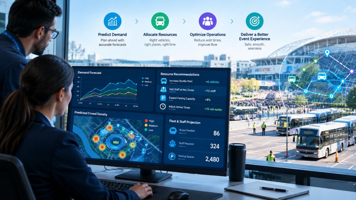
What exactly are predictive insights? Let us understand them correctly. It is known worldwide that major events rarely stick to the original plan. Passenger demand fluctuates, vehicles are delayed, routes become overcrowded, and teams may need to relocate resources on short notice. Predictive insights allow event planners to plan for what is likely to happen next, rather than just what is already happening.
This guide explains how predictive insights play a role in resource planning, how real-time data improves forecasting, and how event transportation management software puts predictions into action.
How Do Predictive Insights Improve Resource Planning for Major Events?
As the term suggests, predictive insights use current and historical event data to identify patterns (predictions) before they actually become issues. With the data, planners are able to make informed decisions by analyzing demand patterns, passenger volumes, traffic conditions, and fleet activity rather than sticking to fixed schedules.
So, if demand is expected to increase following a keynote, transport coordinators and event planners prepare vehicles or staff to handle the surge.
What Event Data Is Used for Predictive Resource Planning?
Predictive planning needs proper operational data; therefore, teams may bring together:
- Data on passenger demand and passenger count
- Real-time vehicle location and movement
- Traffic and travel time patterns
- Route and trip performance
- Pickup and drop-off activities
- Vehicle utilization and idle time
- Event schedules and expected attendance
- Previous event performance
When combined with event transportation management software, this data reveals patterns for future strategizing and planning.
How Does Real-Time Vehicle Tracking Support Event Resource Planning?
Real-time vehicle monitoring offers transportation managers an immediate perspective on fleet activity. When the event starts, resource planning persists. When vehicles experience delays on one route while another has available capacity, teams recognize and rectify the disparity.
Live fleet visibility allows planners to modify assignments and monitor ETAs effectively and efficiently. This turns resource planning into a dynamic operational activity instead of a fixed timetable.
Can Predictive Insights Help to Manage Passenger Demand?
Yes, PAX counting and passenger activity statistics reveal when and where demand is about to increase. Moreover, passenger activity, when combined with predictive data, helps teams get vehicles and staff ready before lines develop.
What Resources Can Event Teams Plan More Effectively?
Predictive insights assist in planning across several operational areas, including:
- Vehicles and Drivers
- Shuttle capacity
- Pick-up and drop-off resources
- Passenger Support Teams
- Dispatch and on-site employees
- Route capacity
- Backup vehicles
- Operational coverage during peak times
Here, the goal is not to add more resources, but to place the appropriate resources whenever and wherever required.
How Does Event Transportation Management Software Turn Insights Into Action?
EventFalcon’s event transportation management software combines prediction and execution. Teams need real-time data, alerts, GPS tracking, passenger information, ETAs, and operational controls in one location. An event transportation command center brings these inputs together, allowing planners to compare expected demand to actual conditions and act more quickly.
So, instead of waiting for a problem to manifest itself, teams can detect and respond to early warning signs.
Why Should Major Events Use Predictive Resource Planning?
Because predictive insights provide a solid foundation for teams to decide and plan where vehicles, personnel, and capacity are needed. EventFalcon combines real-time vehicle tracking, passenger intelligence, fleet visibility, and event transportation management tools to help teams identify movement, understand demand, and respond to changing conditions.
So plan smarter, allocate resources more effectively, and be ready for whatever comes next.
-

 NEWS1 year ago
Historical Churches in Manila
-

 TOPIC4 months ago
Unveiling AvTub: Your Ultimate Guide to the Best AV Content
-

 TOPIC1 year ago
Simbang Gabi and Kakanin
-

 TOPIC1 year ago
Symbols of Hope: The 15th Belenismo sa Tarlac
-

 TOPIC1 year ago
RIZAL at 160: a Filipino Feat in Britain
-

 NEWS5 months ago
What Caused Delta Flight DL275 to Diverted LAX? A Detailed Breakdown
-
 TOPIC3 months ago
Understanding Fascisterne: Origins and Ideological Roots
-

 TOPIC1 year ago
Biodiversity in Urban Singapore: Corporate Contributions to Nature-Based Solutions and Green Infrastructure