
TECHNOLOGY
BacktoFrontShow.com: Podcast Analytics Guide for Creators in 2026

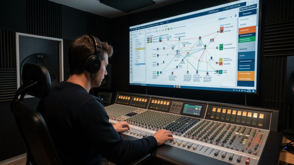
Most creators who land on backtofrontshow.com are not hunting for another download counter. They want to know who stayed through the ad read, who left at minute nine, and whether the audience they pitch to sponsors actually matches the people who press play. That gap between a play count and a real listener is where modern podcast analytics either earns its fee or wastes it.
This guide walks through what the site positions itself as, which metrics matter, how a tracking layer usually sits on top of your host, and where teams waste money. You will also get a practical checklist you can use even if you never buy a premium plan.
What BacktoFrontShow.com Is Built to Do
Backtofrontshow.com presents itself as a podcast analytics platform for hosts, networks, and media teams. The pitch is listener behavior, not vanity totals. Instead of stopping at downloads, the product language centers on demographics, listening patterns, engagement, device mix, geography, and custom reports.
That framing matches a real industry problem. Host dashboards often report downloads and unique listeners. Sponsors, though, ask harder questions. They want age bands, cities, completion, and proof that a mid-roll was heard. A platform that claims to close that gap has to show method, sample size, and limits, not just a polished map.
A short definition you can use
Podcast audience analytics is the practice of measuring how people consume episodes after the file starts. It covers who listens, how long they stay, where they drop off, which device they use, and which episodes earn repeat attention. Downloads only confirm that a file was requested.
How the name gets mixed up
Search results for the brand are messy. An older web-industry podcast, The Back to Front Show, used the same name for years. Separate sites have also used similar branding for business content. The current .com property markets analytics tools and is not the same thing as that earlier show. If you are evaluating the product, judge the dashboard, the data method, and the contract, not the old podcast archive.
How Listener Analytics on BacktoFrontShow.com Usually Works
Platforms in this category rarely replace your host. You keep publishing on Buzzsprout, Libsyn, Spotify for Podcasters, or a private RSS setup. You then add a measurement layer, often an analytics prefix or a tracking redirect on the enclosure URL. When a player requests the episode, the layer records the request and, where the player allows it, progress signals.
The flow is simple on paper.
- Connect the show by RSS or a host integration.
- Confirm the tracking prefix is live on new episodes.
- Wait for a full publishing cycle so the sample is not one lucky week.
- Read demographics, devices, geography, and episode curves.
- Export a report your sales or editorial team can actually use.
Treat the first two weeks as calibration. A launch spike, a playlist add, or a bad embed can distort early charts. Decisions get cleaner after three or four episodes under the same setup.
Metrics worth watching first
| Metric | What it tells you | What to do with it |
|---|---|---|
| Listen-through rate | Share of starters who reach the end, or a set minute mark | Cut or move sections where most people leave |
| Drop-off point | The minute attention collapses | Test a shorter intro or an earlier payoff |
| Unique listeners vs downloads | How many people sit behind the request count | Use uniques in sponsor conversations |
| Device mix | Phone, desktop, smart speaker, in-car | Match ad length and CTA to the dominant context |
| Geography | Countries and cities with real listening | Localize offers, guests, and ad inventory |
| Return listen rate | Share of people who come back next episode | Judge series hooks, not one viral clip |
If a report cannot explain how a demographic was inferred, do not put that number in a media kit. Age and interest estimates are models. Location from IP data is stronger, but VPNs and shared networks still blur city-level claims.
Features That Change Editorial Decisions
A useful stack does more than redraw the same host chart. The feature set described around backtofrontshow.com clusters into a few jobs.
Audience demographics cover age range, location, and interests so you can brief guests and sponsors with something sharper than “people who like podcasts.” Listening behavior covers session length and patterns across the week. Engagement tracking watches likes, shares, and comments where those signals exist. Device analytics shows whether you are an in-car show or a desktop deep-dive. Geographical views turn a country list into a map your partnerships team can scan. Custom reports let you send a client a one-page view instead of a raw export.
A working weekly ritual
Pick one episode and one question. Example: “Did the new cold open keep people past minute three?” Compare that episode with the prior four. If the curve improves and the topic is similar, keep the open. If the curve is flat, the topic was the driver, not the edit.
Then check devices. A show that is 70 percent mobile should not hide the offer behind a long URL spoken once. Say the offer, repeat the short link, and put it in the show notes at the top.
Who Should Pay for This Level of Insight
Not every show needs a heavy analytics layer. A hobby interview with 200 downloads a month will learn more from listener emails than from a premium dashboard. The spend starts to make sense when the number changes a decision that already has a dollar value.
| Team type | Signal you already have | When a deeper platform pays off |
|---|---|---|
| Solo host | Downloads and a few reviews | After you sell even one recurring sponsor |
| Small network | Per-show host stats that do not match | When you need one report format across shows |
| Brand studio | Campaign flight dates and vanity totals | When you must prove mid-roll delivery |
| Agency | Client asks you cannot answer from the host | When reporting time exceeds the tool cost |
Run the math in plain language. If a plan costs more than the sponsorship revenue it helps you win or protect, it is a research toy. If it shortens a sales cycle or saves a renewal, the fee can be rational. Public pricing chatter around this category varies widely, including high monthly tiers on some plan pages. Confirm the live price, the minimum term, and what happens to historical data if you cancel.
Pros and Cons
Strengths show up when the team already publishes on a schedule and has someone who will read the charts.
Pros:
- Behavior data beats download totals in sponsor calls.
- Geography and device mix improve offer design.
- Custom reports reduce the Sunday-night spreadsheet scramble.
- A prefix-style setup can leave your host in place.
- Episode curves give editors a concrete cut list.
Cons:
- Premium plans can cost more than a young show earns.
- Demographic fields are estimates, and bad decks overclaim them.
- Prefix tracking can break if a host or app strips it.
- Early data lies during launches and cross-promos.
- Another login dies if nobody owns the weekly review.
Common Mistakes
Creators repeat the same five errors.
They paste model-based age splits into a media kit as if they were a census. They judge an episode on day-one downloads and ignore the 30-day curve. They change the intro, the thumbnail, and the publish time in the same week, then credit the wrong change. They never check whether the prefix is still on the enclosure after a host migration. They buy the suite, then keep making topics from gut feel.
Another quiet mistake is comparing shows with different lengths. A 12-minute news brief and a 70-minute interview should not share one completion target. Set a benchmark inside the same format.
Best Practices for Using the Data
Treat the dashboard as an editor, not a boss.
- Freeze one variable per experiment. Change the hook or the length, not both.
- Read curves at the same age of episode, such as day 7 and day 28.
- Pair quantitative dips with qualitative notes from listener mail.
- Build a one-page sponsor snapshot: uniques, top countries, average consumption, and device mix.
- Reconcile host downloads with the analytics tool once a month so you trust the gap.
- Archive exports. If you switch tools, you will want the history.
A simple decision framework
| Question | If the answer is yes | If the answer is no |
|---|---|---|
| Do sponsors ask for proof beyond downloads? | Prioritize behavior and geography reports | Stay on the host dashboard for now |
| Can you review charts every week? | Assign an owner and a 20-minute slot | Do not add another unused login |
| Is the tracking prefix stable after publish? | Scale tests across the next four episodes | Fix measurement before you change the show |
| Do estimates match what listeners tell you? | Use demographics as directional color | Label them as modeled and keep claims soft |
How Teams Turn Charts into Better Episodes
Picture a B2B interview show. The curve falls at minute 11, right as the host finishes a long bio. The next four episodes open with the guest’s sharpest claim, then the bio. Average consumption rises by a few minutes. Nothing else changed. That is the whole point of the stack.
A narrative show might see strong completion on phones after 9 p.m. and weak completion on desktop at lunch. The team cuts a tighter chapter and moves the story payoff forward. Sponsorship inventory shifts toward the evening flight, where people actually hear the read.
None of this requires a new brand voice. It requires one person who will look at the curve before the next record date.
What to Verify Before You Commit
Ask for a sample report from a show of similar size. Ask how location and age are produced. Ask whether smart-speaker and locked-down apps undercount progress. Ask about data retention, user seats, and export formats. Ask what the onboarding does to your existing RSS. A clear answer on method is worth more than a rounded satisfaction claim on a marketing page.
If the fit is poor, you still leave with a better measurement habit. Host-level unique listeners, completion where your app provides it, and a simple listener survey will carry a small show a long way.
Conclusion
Backtofrontshow.com sits in a crowded promise: show the listener, not just the download. That promise is worth chasing once a show sells attention or reports to a client. It is not a shortcut to growth by itself. The teams that get value connect the feed cleanly, wait for a real sample, and change one thing at a time. Use the curves to edit. Use geography and devices to shape offers. Keep modeled demographics in their place. Do that, and the dashboard becomes a production tool instead of another tab you forget to open.
FAQs
What is backtofrontshow.com?
It is a website that markets a podcast analytics platform focused on listener demographics, behavior, devices, geography, and custom reports, rather than downloads alone.
Does the platform replace a podcast host?
No. Tools in this category typically sit on top of your current host through an integration or an analytics prefix on the episode file.
How is this different from the older Back to Front Show podcast?
The older show was a web-industry podcast. The current .com property promotes analytics software. They share a name, not a product.
Which metric should a new user watch first?
Start with drop-off points and listen-through rate. Those two numbers tell you whether the episode structure is working before you worry about finer demographic splits.
When is a premium analytics plan worth the cost?
It is worth it when sponsor sales, client reporting, or network rollups already depend on proof you cannot get from a basic host dashboard, and someone on the team will review the data every week.

This guide walks through the main ways people use frehf, where those uses came from, and how to apply the useful parts without copying vague slogans. You will also see common mistakes, a simple practice loop, and answers to the questions readers ask most often.
What Frehf Means in Plain Language
Frehf has no fixed dictionary entry. Writers and users treat it in three overlapping ways.
- As slang, it works like a short reaction: playful, mildly surprised, or lightly sarcastic.
- As a creative label, it points to freshness, originality, and a break from copy-paste style.
- As a framework name, some sites expand it into phrases such as future-ready teamwork or a loop of clarity, iteration, and feedback.
Those uses do not cancel each other out. They live in different rooms. A gaming chat and a strategy memo can both contain the word and mean different things.
A useful working definition is this: frehf is an informal label for something that feels current, flexible, and human, whether that something is a joke, a design choice, or a way of working.
Why the spelling stuck
The letters sit close to “fresh,” with a sharper, less polished ending. That near-miss is part of the appeal. It looks familiar and slightly off, which fits internet language. Nobody owns the spelling, so blogs, meme pages, and small brands have filled the gap with their own definitions. That is why search results disagree.
Where Frehf Shows Up
You will meet the word in a handful of places. The tone changes with the room.
| Setting | Typical use | What the speaker usually means |
|---|---|---|
| Chat and comments | One-word reply | Funny, unexpected, or “I see you” |
| Gaming lobbies | Quick reaction to a fail or clutch | Playful roast or hype |
| Creative portfolios | Tag or caption | Original, not template-driven |
| Brand and product copy | Modifier in a headline | Modern, light, people-first |
| How-to blogs | Named method or mindset | A simple improvement loop |
In chat, frehf rarely needs a definition. Friends already share the joke. In a product page, the same word can confuse a buyer who expected a feature list. Match the setting before you adopt the term.
Slang in everyday messages
In informal threads, frehf behaves like other short reaction words. Someone posts a clip of a ridiculous miss. The reply is “frehf” plus a laugh emoji. No essay follows. The value is speed and tone, not precision.
Examples that match how people actually type it:
- “I reheated pizza in the toaster.” “frehf.”
- “Your edit went from calm to chaos in two seconds.” “frehf.”
- “We won with one player left.” “frehf, that was messy.”
If the other person would not get the joke, skip it. Inside jokes fail in customer support and formal email.
Freshness as a creative stance
In design and content circles, frehf often means work that still feels like a person made it. That can be a voice that does not sound templated, a layout that is not the default theme, or a product story tied to a real use case.
This version is closer to a value than a method. It asks a simple question: does this still feel current and specific, or did we copy last quarter’s version and change the color?
A Practical Frehf Loop You Can Actually Run
Some writers package frehf as Future Ready Enhanced Human Teamwork, or as a lifestyle acronym. Those expansions are invented labels, not a standard from a standards body. You can still borrow the useful core without pretending there is an official manual.
The part worth keeping is a short loop: clarify the next step, try a small change, read the result, adjust.
Step 1: Name one narrow outcome
Pick a result you can see this week. “Improve the onboarding email” is vague. “Cut the first email to four sentences and ask one question” is narrow. Narrow beats ambitious when you are testing tone or process.
Step 2: Change one variable
Change the subject line, or the order of steps, or who owns the follow-up. Do not change all three. If everything moves, you will not know what helped.
Step 3: Set a feedback window
Decide how you will know. A reply rate, a comment from three customers, or a five-minute retro with the team all count. The window should be short enough that you still remember why you changed the thing.
Step 4: Keep or drop the change
If the signal is better, keep it and pick the next small cut. If it is flat or worse, revert and try a different variable. That revert is part of the method, not a failure.
| Loop stage | Question to ask | Example in a content team |
|---|---|---|
| Clarify | What is the next visible result? | Open rate on one newsletter |
| Act | What single change are we testing? | Shorter subject, same send time |
| Read | What signal will we trust? | Opens and replies after two sends |
| Adjust | Keep, tweak, or revert? | Keep length, test send day next |
Teams that already run retrospectives will recognize this. The label is optional. The habit is the point.
How Frehf Differs From Nearby Ideas
People mix frehf up with trend-chasing, with lean process talk, and with generic “be authentic” advice. The differences are practical.
Trend-chasing copies whatever is loud this month. A frehf-style choice can ignore the loud thing if it does not fit the audience. Lean methods focus on waste in a process. The creative use of frehf cares more about whether the output still sounds like the maker. Authenticity advice often stops at “be yourself.” A useful loop adds a check: did the small change help the person on the other side?
You do not need new software to try this. A shared doc, a calendar reminder, and one metric are enough for a first pass.
A small workplace example
A support team kept a long macro for shipping delays. Customers replied with the same three questions. The team cut the macro to the delay date, one compensation rule, and a single link. They watched ticket reopen rates for two weeks. Reopens dropped, so they kept the shorter macro and rewrote the next template the same way. Nobody needed a new framework name. The loop did the work.
A creator example
A newsletter writer noticed posts that opened with a personal detail got more replies than posts that opened with a tip list. For four issues, the writer led with one concrete scene, then the tip. Replies rose. The fifth issue went back to a list as a check. Replies fell. The scene-first open stayed. That is frehf as a stance: specific, tested, not copied from a template pack.
Pros and Cons of Using Frehf
The word is flexible. Flexibility cuts both ways.
Pros:
- It is short and easy to remember in casual spaces.
- It gives teams a shared nickname for “try a small change and look.”
- It pushes creative work away from generic templates.
- It fits hybrid teams that mix human judgment with simple tools.
- It does not require a certification or a new platform.
Cons:
- There is no single definition, so readers may misunderstand you.
- Some pages invent statistics and acronyms that do not hold up.
- Overuse in brand copy sounds like empty trend language.
- Slang use can read as rude outside close groups.
- A label can replace the actual habit if nobody measures anything.
Use the habit in private and the word in public only when your audience already knows it, or when you define it in the same sentence.
Common Mistakes When People Adopt Frehf
Most misses come from treating a loose word like a finished system.
- Quoting made-up percentages. If a page claims a precise drop in “decision fatigue” or “operational variance” without a named study, treat it as marketing, not evidence.
- Expanding the letters into an acronym and presenting it as official. Those expansions are optional mnemonics.
- Using the slang in client email. Tone that works in a Discord server can land as dismissive in a proposal.
- Changing five things at once and calling it a test. You will not know what moved the result.
- Skipping the revert. Keeping a worse version because it feels new misses the point.
- Stuffing the word into every heading. Readers notice. Search systems notice too.
A quick test: could you explain the change to a colleague without using the word frehf? If yes, the practice is real. If no, you may only have a label.
Best Practices for Frehf in Work and Creative Projects
Keep the word light and the process concrete.
- Define it once, in the first mention, if your readers are not already in on the joke or the method.
- Tie every test to one audience outcome: a reply, a completed step, a fewer back-and-forth.
- Limit each cycle to one variable and a set review date.
- Write the result down, including the tests that failed.
- Separate slang from strategy. Do not mix meme tone into a policy page.
- Prefer plain examples over invented origin stories.
- Review the language quarterly. If the word no longer helps the reader, drop it and keep the loop.
These habits travel. A freelance designer, a small support team, and a two-person newsletter can all run them. Large companies can run them inside one squad without a rollout deck.
What to measure
Pick signals you already collect. For a landing page, that might be scroll depth or form starts. For a team ritual, it might be how often a decision waits on a meeting that could have been a note. Fancy dashboards are optional. A shared note with date, change, and result is enough to see a pattern after a month.
Frehf in Branding Without the Empty Promise
Brands sometimes use frehf to signal that a product feels current. That can work if the product actually differs in a way a customer can name. A shorter setup, a clearer return rule, or a voice that answers the real question all qualify. A new adjective on the same feature list does not.
Before you put the word in a headline, answer three checks:
- Can a customer describe the difference after one use?
- Does the claim survive if you remove the trendy word?
- Would you still ship this if nobody else used the term?
If you pass those checks, the label is decoration on a real change. If you fail them, fix the product or the copy first.
Conclusion
Frehf is not one official method, and it does not need to be. In chat, it is a quick reaction. In creative work, it is a nudge toward specific, current, human output. In teams, the useful core is a short loop: name a narrow result, change one thing, read the signal, keep or revert.
Ignore pages that sell precise miracle numbers or a locked acronym. Define the word when your audience needs it, measure the small change, and drop the label if it stops helping. The practice is what stays.
FAQs
What does frehf mean?
Frehf is an informal word with no single dictionary meaning. People use it as a playful reaction, as a label for fresh and original work, or as a nickname for a simple improve-and-adjust loop. Context tells you which one you are seeing.
Is frehf an official framework?
No. Some writers expand it into teamwork or lifestyle acronyms, but those expansions are not a standard from a recognized body. You can still use the underlying habit of small tests and feedback.
How do you use frehf in a sentence?
In chat: “frehf, that clip was wild.” In a work note: “We ran a frehf-style test on the welcome email and kept the shorter version.” Define the term if the reader may not know it.
Is frehf the same as being trendy?
Not quite. Trend-chasing copies what is popular. A frehf-style choice can skip the trend if a small, specific change serves the audience better. The check is the result, not the noise.
Should brands use the word frehf?
Only if the product difference is real and you explain the word. Empty use in headlines reads as vague marketing. A clear feature, a tested message, and plain language matter more than the label.

If you need a quick picture of what a draft is actually about, the uploadwords.com free word cloud is one of the simplest ways to get it. Paste a paragraph, an essay, or a full article, and the tool turns repeated terms into a visual map. Bigger words show up more often. Smaller words show up less. That single glance can tell you whether your topic is clear or buried under filler.
UploadWords is a free text toolkit. You do not create an account. The site describes the analysis as happening in your browser, and it pairs the cloud with a word count, a character count, and a top-keyword list. You can also download the cloud as a PNG. That combination is why students, writers, and marketers keep coming back to it.
This guide shows what the free word cloud does, how to read it, and how to use it without turning your writing into a pile of repeated phrases.
What the UploadWords.com Free Word Cloud Actually Shows
A word cloud is a picture of frequency. Words that appear more often are drawn larger. Words that appear less often stay small. It is not a grade. It is not a ranking report. It is a snapshot of emphasis.
On UploadWords, that snapshot sits next to numbers you can check. The word count tells you length. The character count helps with captions, meta lines, and short posts. The keyword list ranks terms by how often they appear. The cloud makes the same idea visible.
The site also offers two filters that change the picture:
- A stopwords toggle hides common fillers such as “the,” “and,” and “of.”
- A minimum word length filter drops very short words so meaningful terms can rise.
Turn those on when the cloud looks noisy. Leave them off when you want a raw view of every repeated token.
Who gets the most from a free word cloud
Different jobs need different checks. The same graphic still helps each group.
- Students use it to see whether an essay stays on the assigned topic.
- Writers use it to catch a pet phrase that shows up on every page.
- Bloggers use it to confirm the main subject is visible before they publish.
- Marketers use it to scan reviews, briefs, or landing-page copy for repeated themes.
- Teachers use a downloaded PNG in slides when they want a class to talk about emphasis.
How to Build a Word Cloud on UploadWords
You can finish a first pass in a couple of minutes. The steps stay the same whether you paste a short caption or a long draft.
- Open UploadWords in your browser. No signup is required.
- Paste your text, or upload a plain TXT file if that option is on screen.
- Check the word count and character count against your target.
- Scan the top keywords. Ask whether the biggest terms match the point you meant to make.
- Open the word cloud preview. If filler words dominate, turn on stopwords or raise the minimum length.
- Download the PNG if you need it for a slide, a report, or a study note.
- Edit the draft, paste it again, and compare the new cloud with the old one.
That last step matters more than the first picture. A cloud is useful when you treat it as a before-and-after check, not as a decoration.
A simple reading method
Look at the three largest words first. If they match your topic, the draft is probably on track. If they are generic verbs or repeated transitions, the cloud is telling you the real subject is too quiet.
Then look at what is missing. A product page about shipping times should not hide “delivery” under a pile of “great” and “really.” An essay about soil health should not bury “nutrients” under “also” and “however.”
UploadWords.com Free Word Cloud vs Other Quick Checks
People often mix up a visual cloud with a full edit. They are not the same job. Use this comparison before you decide which check to run.
| Check | What you learn | Best moment to use it | Limit |
|---|---|---|---|
| Word cloud | Which terms dominate the draft | After a full draft, before polish | Size is frequency, not quality |
| Top keyword list | Exact counts for repeated terms | When you need numbers, not a picture | Does not judge relevance by itself |
| Word count | Length against a limit or goal | Assignments, briefs, captions | Says nothing about focus |
| Character count | Space used, with or without spaces | Meta lines, ads, bios | Easy to misread if spaces are included |
| Manual read-aloud | Rhythm, clarity, awkward repeats | Final pass | Slow on long documents |
The free cloud wins when you want speed and a shareable image. The keyword list wins when you need a number for a brief. A human read still wins when tone and logic matter.
Practical Examples You Can Copy
Examples make the graphic easier to trust. Here are three short cases.
Essay check. A student pastes a 1,200-word paper on urban trees. After stopwords are removed, “trees,” “shade,” and “streets” sit at the top. “Parking” appears once. The student adds a short section on street design so the argument matches the title.
Blog draft. A writer pastes a post about home bread. The cloud is dominated by “dough.” “Salt,” “proof,” and “oven” are tiny. The writer adds those terms in the method section so a skimmer can see the real steps.
Review scan. A shop owner pastes twenty customer comments. “Late” and “packaging” jump out. “Friendly” is present but smaller. The owner fixes shipping notes before spending more on ads.
In each case the cloud did not rewrite the text. It pointed at a gap the writer could fix.
What a healthy cloud tends to look like
A useful cloud usually has:
- One clear subject near the top
- A handful of supporting terms in the middle sizes
- Few identical filler phrases
- No surprise word that belongs to a different topic
If every word is the same size, the text may be too short or the filter may be off. If one word swallows the picture, you may be repeating a phrase instead of explaining it.
Feature Breakdown Worth Knowing
UploadWords keeps the feature set small on purpose. That is part of the appeal. Here is what each piece is for.
| Feature | What it does | Practical use |
|---|---|---|
| Paste box | Accepts copied text | Fast checks from docs or email |
| TXT upload | Reads a plain-text file | Longer notes without copy-paste errors |
| Word count | Totals words | Assignment and brief limits |
| Character count | Totals characters | Captions and short descriptions |
| Top keywords | Lists frequent terms | Spot repetition with numbers |
| Word cloud | Draws size by frequency | Slides, study notes, quick reviews |
| Stopwords toggle | Hides common fillers | Cleaner visual of real topics |
| Min length filter | Drops very short words | Less noise from tiny tokens |
| PNG download | Saves the cloud as an image | Reports and classroom slides |
| Copy results | Copies counts and lists | Paste into a brief or checklist |
Privacy is part of the pitch. The about page says text is processed in the browser for analysis and is not published. Still, skip passwords, IDs, and client secrets. A free visual tool is not a vault.
Pros and Cons
No single checker fits every job. Weigh these points before you build a habit around the cloud.
Pros
- Free, with no account wall on the core checks
- Word count, keywords, and cloud in one pass
- Stopwords and length filters clean up noisy drafts
- PNG download works for slides and handouts
- Fast enough for a between-draft glance
- Useful for students, editors, and marketers alike
Cons
- Size shows frequency, not importance or accuracy
- Very short texts produce thin, uneven clouds
- Proper nouns and odd spellings can distort the picture
- It will not fix grammar, structure, or facts
- Sensitive text still should not be pasted casually
- A pretty cloud can hide a weak argument
Use the pros when you need a fast visual. Respect the cons when the document is confidential or when the decision needs more than a picture.
Common Mistakes
Most weak results come from how people read the cloud, not from the tool itself.
- Treating the biggest word as proof the draft is good. Frequency is not quality.
- Leaving stopwords off, then panicking because “the” is huge.
- Pasting a title, headings, and repeated calls to action, then wondering why one phrase owns the image.
- Ignoring missing terms. Absence is often the more useful signal.
- Downloading the PNG and never editing the source text.
- Using the cloud on a 40-word caption and expecting a rich map.
- Stuffing the main phrase until it dominates, which makes the writing stiff.
A cloud should start an edit. It should not end one.
Best Practices for a Clearer Cloud
A few habits make the uploadwords.com free word cloud easier to trust.
- Paste the body only. Leave out menus, footers, and repeated buttons.
- Turn on stopwords for topic checks. Turn them off only when you are hunting filler.
- Set a minimum length of three or four characters if short tokens clutter the view.
- Compare two versions. Save the first PNG, edit, then generate a second cloud.
- Pair the picture with the keyword list so you have both a visual and a count.
- Keep one human read after the visual pass. Rhythm still matters.
- For class or client slides, download the PNG only after the text is final.
A short workflow you can repeat
| Step | Action | Done when |
|---|---|---|
| 1 | Paste body text only | Counts match your draft |
| 2 | Enable stopwords | Fillers drop out of the top |
| 3 | Read the three largest words | They match the intended topic |
| 4 | Note missing terms | Gaps are listed for the edit |
| 5 | Revise and rerun | New cloud looks balanced |
| 6 | Download PNG if needed | Image matches the final text |
This loop is enough for essays, posts, product blurbs, and feedback dumps. You do not need a complicated dashboard.
When a Word Cloud Is the Wrong Tool
Skip the cloud when you need citation checks, legal review, or a tone pass on a sensitive email. It also struggles with poetry, dialogue-heavy fiction, and text full of names. In those cases, frequency pictures over-reward repeated labels and under-reward craft.
Use it when the question is simple: what does this text emphasize, and is that what I meant?
Conclusion
The uploadwords.com free word cloud is a fast visual check, not a verdict on your writing. Paste the body, filter the fillers, and read the largest words against your real topic. Pair the picture with the word count and the keyword list. Then edit, run it again, and download the PNG only when the draft matches the image.
Students get a topic check. Writers catch repeats. Marketers see themes in feedback. Used that way, a free cloud earns its place between the first draft and the final read.
FAQs
Is the UploadWords word cloud free?
Yes. UploadWords presents the word cloud, word count, character count, and top keywords as free, with no signup required for the core tool.
Can I download the word cloud?
Yes. The site describes a word cloud preview plus a PNG download, which is handy for slides, reports, and class notes.
Why is my word cloud full of small words like “the”?
Common fillers rise when stopwords are off. Turn on the stopwords toggle or raise the minimum word length so topic terms can stand out.
Does a bigger word mean the draft is better?
No. Bigger only means the word appears more often. Quality still depends on clarity, accuracy, and whether the large words match your point.
Is my text kept private?
UploadWords says analysis runs in the browser and that text is not published. Even so, avoid pasting passwords, personal IDs, or confidential client material.

You land on bumpdots.com and the name does not explain itself. It is not a shop for tactile markers, and it is not a social app. It is an independent digital publication that explains technology, business, finance, education, health, and travel in plain language for people who want context without a textbook.
The site started in 2024. Kavin Paul, a publisher and digital media strategist based in Noida, India, is publicly listed as the founder. The domain was registered in May 2024. Since then, the publication has built a library of explanatory articles rather than product listings or paywalled briefs.
If you searched the name because a link showed up in results, this guide covers what the site publishes, how to read it well, and where it falls short.
What Is bumpdots.com?
Bumpdots.com is an online magazine and editorial site. It publishes informational articles for a general audience. Core reading is free. You do not need an account to open a story, and the site does not sell physical accessibility products.
That last point matters. The phrase “bump dots” usually refers to raised tactile markers used on appliances and keyboards. This website is not that business. Its about pages state clearly that it does not manufacture, distribute, or sell Braille labels, locator dots, or related goods.
The editorial idea is simple. Take a subject people already search for, research it, and write it so a non-specialist can follow the argument.
Who it is for
The typical reader is curious, not certified. They might want a clear take on digital finance, a practical look at work routines, or a plain explanation of a technology story. Beginners get definitions. Experienced readers get structure and examples they can reuse.
What bumpdots.com Covers Across Its Sections
Coverage is broad on purpose. A single niche would be easier to brand, but daily life does not stay in one lane. Money decisions sit next to tools. Travel plans sit next to health habits. The publication treats those links as normal.
Main areas include:
- Technology and artificial intelligence, written for readers who do not write code
- Business and entrepreneurship, including how small teams actually operate
- Finance and financial technology, with an emphasis on concepts rather than hot tips
- Education and skills
- Health and everyday wellness
- Travel planning and destination context
- Digital marketing and online work
Articles often run long enough to set a definition, add an example, and close with a usable takeaway. Recent pieces have looked at phone-number checks, location context near transit hubs, why routines are changing, and what sits behind digital payments.
How a typical article is built
Most pieces follow a repeatable shape. They open with the question a reader already has. They define the term early. They break the topic into short sections. They close with practical notes rather than a slogan.
That structure is useful if you skim. You can grab the definition, scan the list, and leave with one action.
| Topic area | What you usually get | Best used for |
|---|---|---|
| Technology and AI | Plain explanations of tools and trends | Deciding whether a new tool is worth your time |
| Business | Operating context for founders and teams | Framing a decision before you spend |
| Finance | Concepts behind apps, payments, and markets | Understanding a product before you trust it |
| Education | Skill and learning context | Choosing what to study next |
| Health and travel | Everyday guidance, not clinical advice | Planning, not diagnosis |
How to Use the Site Without Wasting a Session
Open the homepage and pick one category that matches a decision you already have. Do not try to “catch up” on every section. A broad publication rewards a narrow visit.
Read the first two sections fully. If the definition matches your question, continue. If it drifts into a neighboring topic you do not need, stop and search the site for a closer piece. That habit saves more time than any bookmark folder.
Treat numbers and claims the way you would on any independent site. Note the date. Check whether the piece cites a source you can open. Use the article as a map, then confirm anything that affects money, health, or legal choices with a primary source.
A practical example: you see a story on digital finance. Use it to learn how a payment flow works and which questions to ask your bank. Do not treat it as an instruction to move funds.
Pros and Cons of Reading bumpdots.com
No publication is a complete library. The value here is clarity and range. The limit is the same range. A generalist site will not replace a specialist journal.
Pros:
- Free access to core articles, with no paywall on standard reading
- Language aimed at non-specialists
- Several life topics in one place, so related ideas sit near each other
- Independent editorial stance rather than a product catalog
- Clear separation from tactile-product brands that share similar wording
Cons:
- Breadth can dilute depth on highly technical subjects
- A young publication, launched in 2024, so the archive is still growing
- General health and finance pieces are explainers, not personal advice
- Quality can vary by topic if coverage stretches thin
- The name confuses people who expected a physical-goods store
| Strength | Limitation | What to do about it |
|---|---|---|
| Clear explainers | Not a specialist deep-dive | Pair with a primary source on high-stakes topics |
| Free reading | Archive still young | Check the publish date before you rely on it |
| Many categories | Easy to wander | Pick one question per visit |
| Independent voice | Not a regulator or advisor | Do not treat articles as official guidance |
Common Mistakes Readers Make
People misread the name and expect a shop. They bounce, or they email about an order that does not exist. Read the about page once and that confusion ends.
Another mistake is treating every article as current. Digital tools and fee structures change. A solid explainer from last year can still teach the concept and still miss this month’s rule.
A third mistake is reading only the headline. These pieces earn their keep in the middle sections, where the definition and the example sit. Skim those, not just the title.
Finally, some readers want the site to pick a side on every trend. The stronger pieces explain the mechanism and leave the verdict with you. If you need a verdict, write it down yourself after you finish.
Best Practices for Getting Useful Reading
Start with a question, not a category binge. “How do I tell if this number is worth calling back?” beats “show me everything on technology.”
Cross-check anything that touches money, medicine, or travel rules. Use the article to build a checklist, then confirm the checklist against an official page.
Save pieces by decision, not by date. A note titled “questions before I switch payment apps” will outlast a bookmark named after the headline.
If you write or research for work, borrow the structure: definition first, short sections, one concrete example, a clear limit on what the piece does not cover. That pattern is why general readers stay.
Return for updates on topics you already care about. A growing independent site is most useful when you already know which desk you want.
How It Compares With Other Reading Habits
News homepages optimize for what happened in the last hour. Specialist newsletters optimize for one industry. Bumpdots.com sits between those habits. It is slower than a wire and wider than a trade brief.
Use breaking news when you need the event. Use a specialist source when the cost of being wrong is high. Use an explainer site when you need the background before either of those.
| Reading need | Better first stop | Role of an explainer site |
|---|---|---|
| What happened today | News wire or trusted daily | Background after the headline |
| A regulated decision | Official or licensed source | Questions to ask that source |
| A new concept | Plain-language publication | Definition and worked example |
| A product purchase | Maker or retailer | Context, not the checkout |
Conclusion
Bumpdots.com is an independent digital publication founded in 2024 by Kavin Paul. It explains technology, business, finance, education, health, and travel for general readers, and it does not sell tactile bump dots or related goods. Read it for definitions and context. Confirm high-stakes details elsewhere. Used that way, the site is a practical stop between a noisy feed and a specialist journal.
FAQs
What is bumpdots.com?
It is an independent online publication that publishes free explanatory articles on technology, business, finance, education, health, and travel.
Is bumpdots.com a store for tactile markers?
No. The site states that it does not make or sell bump dots, Braille labels, or accessibility stickers. It is an editorial website.
Who founded bumpdots.com?
Kavin Paul is publicly listed as the founder. The publication is associated with Noida, India, and the domain dates to May 2024.
Is bumpdots.com free to read?
Yes. Core articles are available without a paywall or an account.
Is bumpdots.com safe to visit?
It operates as a standard informational website and does not require payment details to read. As with any site, avoid sharing personal data you do not need to share, and verify claims that affect money or health.
-

 NEWS1 year ago
Historical Churches in Manila
-

 TOPIC3 months ago
Unveiling AvTub: Your Ultimate Guide to the Best AV Content
-

 TOPIC1 year ago
Symbols of Hope: The 15th Belenismo sa Tarlac
-
 TOPIC1 year ago
RIZAL at 160: a Filipino Feat in Britain
-

 TOPIC1 year ago
Simbang Gabi and Kakanin
-
 TOPIC2 months ago
Understanding Fascisterne: Origins and Ideological Roots
-

 TOPIC1 year ago
“The Journey Beyond Fashion” – Ditta Sandico
-

 NEWS4 months ago
What Caused Delta Flight DL275 to Diverted LAX? A Detailed Breakdown