
TECHNOLOGY
How to Generate UGC Video Ads That Actually Convert in 2026


User-generated content has quietly become the most trusted form of advertising on the internet. Scroll through TikTok, Instagram Reels, or YouTube Shorts for ten minutes and you’ll see what I mean — the ads that stop your thumb don’t look like ads at all. They look like a friend filming themselves in their kitchen, raving about a new protein powder or showing off a gadget they just unboxed.
The problem? Producing that kind of content at scale is brutal. You need creators, scripts, props, lighting, editing, and a willingness to film the same 30-second clip seventeen times before it feels natural. For most small brands and solo marketers, that’s a non-starter. Which is why AI-generated UGC has exploded over the past year, and why it’s worth understanding how to do it well rather than churning out the same recycled avatars everyone else is using.
Why UGC Outperforms Polished Brand Content
Before we get into the tools, it’s worth pausing on why this format works in the first place. Traditional ads trigger the part of your brain that says “someone is trying to sell me something.” UGC bypasses that filter. When a real-looking person holds a product up to a camera and explains why they like it, viewers process the message more like a recommendation than a pitch.
The data backs this up. Nielsen studies have consistently shown that consumers trust peer recommendations far more than brand-produced advertising, and platforms like Meta and TikTok openly favor UGC-style creatives in their algorithms because they keep users watching longer.
This is where Pollo AI has carved out a useful niche. Instead of relying on stiff stock avatars, you can use Pollo AI to generate UGC video ads that feature lifelike presenters speaking your script in a variety of settings — kitchens, bedrooms, offices, outdoor scenes — with natural lip sync and expressive delivery. The output feels closer to real creator content than the uncanny avatar videos most platforms produce.
Building a UGC Workflow That Doesn’t Burn You Out
The biggest mistake I see marketers make is treating AI UGC like a “press button, get ad” situation. It isn’t. The tools handle production, but you still need to think like a creative director. Here’s the workflow I’ve found works best.
Start with the hook. The first three seconds determine whether anyone watches the rest. “POV: you finally found a skincare routine that works” outperforms “Hi, today I want to tell you about…” every single time. Write five hook variations before you generate anything.
Next, write the script in spoken English, not marketing English. Read it out loud. If you wouldn’t say it to a friend at a coffee shop, rewrite it. Contractions, pauses, and even small filler words (“honestly,” “okay so”) make the final video feel human.
Then generate. Pick a presenter whose energy matches the product — high-energy for fitness, calm and conversational for finance apps, warm for home goods. Match the background to the claim. A skincare ad shot in a “bathroom” lands harder than the same script delivered in a generic studio.
Choosing the Right AI UGC Platform
Not every tool is built for the same job, and the landscape has gotten crowded fast. Here’s how a few of the leading options compare in practice.
Pollo AI has become my default for UGC specifically because of how natural the presenters look and how much creative control you get over scenes, props, and pacing. It’s also one of the few platforms where you can chain multiple clips together without losing visual consistency.

InVideo AI is a strong alternative if your workflow is more text-to-video focused — you can paste in a blog post or product description and get a serviceable ad out the other end. It’s faster for batch production but less tailored to the UGC aesthetic specifically.
For brands that want a middle ground between full UGC and motion-graphic explainer videos, options like Animoto and Steve AI are worth a look, particularly if you’re producing content for LinkedIn or B2B audiences where polished templates outperform raw creator content.
Testing and Iterating
Once you have your first batch of videos, resist the urge to pick a favorite and run with it. The whole point of using AI is volume. Generate five to ten variants of every concept — different hooks, different presenters, different backgrounds — and let the platform’s ad algorithm tell you which one wins. I’ve watched campaigns where the version I personally hated outperformed my favorite by 4x. Trust the data, not your gut.
Also pay attention to length. Most UGC ads should land between 15 and 30 seconds for paid social. Anything longer needs a much stronger hook to retain viewers, and anything shorter rarely gives you room to actually make the sale.
Common Mistakes Worth Avoiding
A few things will torpedo your results no matter how good your tool is.
Overproducing the script kills authenticity. If your “creator” sounds like they’re reading a teleprompter written by a copywriter who’s never used the product, viewers tune out instantly. Loosen up the language.
Ignoring captions is another big one. Roughly 80% of social video is watched on mute. If your ad relies on audio to make the point, half your audience misses it. Always burn in captions, and make them visually interesting — bold, animated, color-coded.
Finally, don’t forget the call to action. UGC ads often feel so natural that creators forget to actually ask for the click. A simple “link’s in bio” or “I’ll drop the link below” delivered casually at the end converts better than any flashy graphic.
Where to Go From Here
If you’re just getting started, pick one product and one angle, write three hook variations, and produce six videos. Run them as a small test budget for a week. You’ll learn more from that exercise than from reading another five articles like this one.
The brands winning at paid social right now aren’t the ones with the biggest budgets — they’re the ones testing the most creatives per week. AI UGC tools have made that pace possible for everyone, and the marketers who treat it as a creative discipline rather than a shortcut are the ones pulling ahead.


Have you ever wondered how life sciences organizations keep sensitive data safe? Every day, these companies collect and store huge amounts of information. This includes patient records, research data, and personal details.
Data breaches can cause serious harm to people and businesses. That’s why data security is more important than ever in this industry. Protecting data is not only about technology, but also about careful planning.
In this blog post, readers will discover simple and effective strategies to keep life sciences data secure. Learn how to stay protected and avoid common risks by reading further. Keep on reading!
Using Strong Data Encryption
Data encryption is a powerful way to protect information. It scrambles data so only people with the right key can read it. This means if someone steals the data, they cannot use it.
Encryption should be used both when data is stored and when it is sent over the internet. By making data unreadable to outsiders, organizations can keep sensitive information safe.
Managing Access to Data
Access management controls who can view or change data. Only trusted employees should be allowed to handle sensitive information.
Strong passwords and frequent updates help prevent unauthorized access. Companies should use two-factor authentication for extra protection. Regularly reviewing who has access can catch problems early.
Training Employees Regularly
People are often the weakest link in data security. Regular training helps staff spot threats and avoid mistakes.
Employees learn how to recognize phishing emails and unsafe links. Training should be simple and updated often. When everyone understands their role, the whole team works together to keep data safe.
Keeping Software Up to Date
Outdated software can be a big risk for data security. Hackers often target old programs with known weaknesses.
Installing updates and patches closes these gaps. Companies should schedule regular checks for updates on all devices. This simple habit can stop many attacks before they happen.
Backing Up Data Frequently
Backing up data means making safe copies in case something goes wrong. These backups should be stored in a secure location, separate from the main data.
Backups help recover information after a cyberattack or technical problem. Tests should be done to make sure backups work correctly. Frequent backups can save time, money, and trust if disaster strikes.
Working with Trusted Partners
Sometimes, life sciences companies need to share data with others. Only trusted partners should have access to sensitive information.
Contracts and agreements can help set clear rules. It is important to check that partners also follow strong data security practices. For more on the value of data, see how big data is transforming the field at https://www.cnxsi.com/unleashing-the-potential-of-big-data-in-life-sciences-navigating-the-seven-critical-factors/.
Building a Stronger Data Security
Data security is more than just keeping files and computers safe. It also helps safeguard studies, patient privacy, business operations, and public trust. Strong protection is provided by encryption, and strict access-control rules limit who can see private data.
Additional layers of security include staff training, updates, backups, and monitoring. Collectively, these simple steps strengthen your defense against common security risks. Life sciences organizations can keep important data safe and support reliable work every day with consistent care and clear procedures.
Did you like this guide? Great! Please browse our website for more!

Why is my IT bill higher this month than last month? If you are a business leader or financial director, you have likely asked this question while staring at a surprisingly high vendor invoice. You carefully plan your operational budget, only to have it derailed by a sudden emergency repair or an unexpected hardware failure. It feels like you are writing blank checks just to keep your business running.
This frustration is completely justified. Treating your technology as a series of isolated emergencies creates a financial illusion. On paper, paying only when things break seems like a cost-effective strategy. In reality, this traditional approach hides the compounding costs of recurring problems, lost productivity, and emergency response fees.
The first step toward a predictable, flat-rate IT budget is understanding exactly where this money is leaking. An ever-growing IT bill is rarely the result of one massive failure. Instead, it is the symptom of a reactive strategy that ignores the root causes of daily technological friction.
By shifting your perspective from reaction to prevention, you can stop the bleeding. You can transform your technology from an unpredictable liability into a stable, manageable asset.
Key Takeaways
- Unmanaged tech sprawl and overlapping software subscriptions are silent budget killers that inflate your monthly expenses.
- Employee downtime and lost productivity cost significantly more than the vendor invoices required to fix the underlying issues.
- Partnering with a proactive, relationship-focused managed service provider stabilizes your costs through predictable, flat-rate billing.
Unmasking the Hidden Costs Draining Your Budget
Beyond emergency repairs, business leaders often harbor a nagging suspicion about their daily operations. Am I paying for software, licenses, or services my team doesn’t even use? In most cases, the answer is yes. As companies grow, they naturally accumulate new applications, cloud services, and digital tools.
This rapid accumulation leads to “tech sprawl.” Different departments often purchase software to solve their immediate problems without consulting leadership. Marketing might buy a project management tool while sales subscribes to a nearly identical platform. This shadow IT creates overlapping subscriptions, redundant services, and wasted capital that quietly inflates your bill every single month.
Proper lifecycle management and regular technology audits are the only ways to eliminate this bloat. You need a clear inventory of what you are paying for, who is using it, and whether it still serves a business purpose. Consolidating tools and canceling abandoned subscriptions can instantly reduce your monthly overhead. Reclaiming wasted spendings is a fast, effective way to stabilize your IT budget.
The Staggering Financial Toll of Employee Downtime
Vendor invoices and software bloat are frustrating, but they are only a fraction of your true technology costs. The real budget killer is lost employee productivity. How much is downtime actually costing your business? When your network goes down or a critical application crashes, your payroll expenses do not pause. You are actively paying your staff to wait for a resolution.
When employees struggle with clunky, failing IT, the damage extends beyond the clock. Valuable time is lost, but morale also drops significantly. Frustrated employees are less engaged, and minor technical hurdles quickly snowball into larger operational risks. A missed email or a delayed file transfer can jeopardize a client relationship or hold up an entire manufacturing line.
The financial drain of these outages is massive, even for small and mid-sized operations. This reality connects directly back to the value of a highly responsive help desk. When you have a reliable team ready to resolve issues immediately, you protect your most valuable asset: your employees’ time. Proper end-user training and proactive support empower your staff to do their best work, rather than leaving them frustrated by the tools they need to succeed.
Proactive Managed Services vs. Reactive Support
The best way to eliminate unpredictable expenses is to change how you manage your technology. A proactive Managed Service Provider (MSP) actively stabilizes your IT costs by preventing surprise emergencies before they happen. Instead of waiting for the server to crash, an MSP monitors network health continuously. They apply patches, update security protocols, and replace aging hardware on a planned schedule.
This shift provides a highly tangible return on investment. The most immediate benefit is flat-rate billing. With an MSP, you pay a predictable monthly fee for comprehensive management and support. This eliminates the wild fluctuations of the break-fix model. You also benefit from drastically reduced downtime and continuous pattern tracking, ensuring recurring issues are permanently resolved.
However, not all managed service providers are created equal. You need a partner who takes a “Relationships First, Technology Second” approach. A true IT partner takes the time to deeply understand your specific operational goals, compliance requirements, and budget constraints.
This level of partnership is vastly different from a traditional, transactional help desk. A massive call center reading from a script cannot provide strategic guidance. They only know how to reset passwords and close support tickets. A proactive partner acts as an extension of your leadership team, ensuring your technology investments are fully protected and optimized for your unique workflow.
Aligning Technology with Your Broader Business Strategy
Stabilizing your current IT budget is an important first step, but how do you prevent bloated spending in the future? The answer lies in aligning your technology with your broader business strategy. Every tech investment you make must be deeply purposeful. Buying shiny new tools simply because they are popular is a guaranteed way to waste capital.
If you purchase a new software platform without a clear employee adoption plan, that tool will quickly become shelfware. Strategic IT planning means right-sizing your technology. It requires evaluating your actual business needs and finding solutions that fit those requirements perfectly, without paying for unnecessary premium features you will never use.
Proactive maintenance and forecasting are also essential for long-term budget control. A strong IT partner will help you build a technology roadmap. This roadmap outlines when hardware will reach the end of its lifespan and when software will require major upgrades. Budgeting for these expenses years in advance reduces the risk of costly, sudden disruptions tomorrow.
Ultimately, technology should directly support your business goals. It exists to simplify workflows, improve client delivery, and drive revenue. When your technology complicates your daily operations, it is failing its primary purpose. Strategic alignment ensures every dollar spent on IT pushes your business forward.
Conclusion
An ever-growing IT bill is a clear symptom of a reactive, break-fix strategy that ignores the root causes of technology failure. Trying to save money by only paying for emergency repairs is a flawed approach. It leaves your business vulnerable to compounding costs, hidden software bloat, and massive productivity losses.
The macro-level financial impact of poor IT management is severe. Studies show that companies lose an average $300 million a year to unplanned outages and suffer an average 3.4% stock price drop after a single incident. While your specific numbers may differ, the principle remains exactly the same: downtime is incredibly expensive.
Transitioning from a reactive stance to a proactive, relationship-driven IT model changes everything. It eliminates the anxiety of unpredictable monthly expenses and protects your operational bottom line. By partnering with a team that values your long-term success, you can finally stop worrying about surprising vendor invoices and start focusing entirely on business growth.
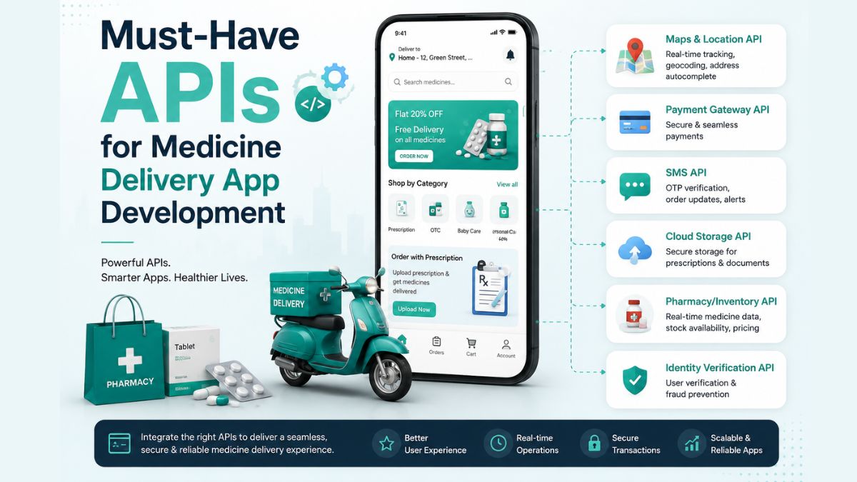
The healthcare industry has experienced a major digital transformation in recent years, with medicine delivery apps becoming an essential service for millions of people.
From ordering prescription medications to receiving over-the-counter products at home, these apps offer convenience, accessibility, and timely care. As customer expectations continue to rise, businesses entering this market need more than an attractive user interface.
Whether you’re developing an app for a pharmacy chain, healthcare startup, or online medicine marketplace, choosing the right APIs can significantly impact your application’s performance, scalability, and compliance.
In this guide, you’ll learn why APIs are essential, how they support different app functionalities, and which integrations every medicine delivery platform should consider.
What Are APIs in Medicine Delivery Apps?
An Application Programming Interface (API) is a set of rules that allows different software systems to communicate and exchange information. In a medicine delivery app, APIs act as bridges between your application and external services, helping different components work together smoothly.
For example, when a customer uploads a prescription, an OCR API can extract the medicine details. When the user proceeds to payment, a payment gateway API securely processes the transaction. Once the order is confirmed, a location API helps assign the nearest delivery executive and provides real-time tracking until the medicine reaches the customer’s doorstep.
Without APIs, developers from a trusted medicine delivery app development company would need to build every service independently, increasing development time, costs, and maintenance efforts. APIs simplify complex processes by allowing businesses to integrate specialised services that are already tested, secure, and scalable.
Why API Integration Matters for Medicine Delivery Apps?
APIs are much more than technical connectors. They directly influence how efficiently a medicine delivery platform operates and how users interact with it.
One of the biggest advantages is faster development. Instead of creating features like payment processing, maps, or messaging from scratch, developers can integrate proven APIs that are ready for deployment. This accelerates product launches while reducing development costs.
API integration also enhances the user experience. Features such as real-time order tracking, instant payment confirmation, automated notifications, and accurate location services create a smoother customer journey and build trust.
For businesses aiming to build a competitive medicine delivery platform, API integration is not simply a convenience—it’s a necessity for creating a secure, scalable, and customer-focused application.
Must-Have APIs for Medicine Delivery App Development
1. User Authentication APIs
Security begins with user authentication. Medicine delivery apps store personal details, medical prescriptions, addresses, and payment information, making secure login systems essential.
Authentication APIs simplify user registration while protecting accounts against unauthorised access. They support multiple login methods, including email, mobile numbers, one-time passwords (OTP), biometric authentication, and social sign-ins.
2. Maps and Location APIs
Accurate location services are the backbone of every medicine delivery application. Customers expect quick deliveries, live order tracking, and precise delivery estimates.
Maps and location APIs enable businesses to locate nearby pharmacies, calculate delivery distances, optimise routes, and display real-time driver locations. They also help delivery executives avoid traffic congestion by suggesting the fastest available routes.
3. Payment Gateway APIs
A secure payment experience is essential when you are looking for how to create a medicine delivery app efficiently. Customers should be able to complete transactions quickly using their preferred payment methods.
Payment gateway APIs enable businesses to accept credit cards, debit cards, digital wallets, UPI payments, net banking, and even recurring subscription payments for regular medicine orders.
4. Prescription Upload and OCR APIs
Prescription management is one of the defining features of a medicine delivery platform. Customers often upload handwritten or printed prescriptions before placing an order.
OCR (Optical Character Recognition) APIs automatically extract medicine names, dosages, quantities, and prescription details from uploaded documents. This reduces manual data entry while improving processing speed.
5. Pharmacy Management APIs
Medicine availability changes frequently due to inventory fluctuations. Pharmacy management APIs synchronise stock levels between pharmacies and the medicine delivery platform in real time.
When customers search for medications, these APIs instantly display product availability, pricing, stock quantities, and alternative options if a medicine is unavailable.
6. Medicine Database APIs
Customers rely on medicine delivery apps not only to purchase medications but also to access accurate information before placing an order. Medicine Database APIs provide comprehensive drug-related data, helping users make informed decisions while reducing confusion about prescriptions and over-the-counter medicines.
These APIs retrieve information such as medicine names, active ingredients, dosage instructions, side effects, contraindications, storage recommendations, and generic alternatives. They can also alert users to potential drug interactions or allergy risks, depending on the available data source.
7. Delivery Tracking APIs
Customers expect complete visibility into their medicine orders. Whether it’s an emergency prescription or a recurring medication refill, real-time tracking enhances transparency and builds confidence throughout the delivery process.
Delivery Tracking APIs allow users to monitor every stage of their order, from pharmacy confirmation to driver assignment, pickup, and final delivery. These APIs continuously update delivery status and estimated arrival times, ensuring customers remain informed without contacting customer support.
8. Notification APIs
Effective communication plays a significant role in the customer experience. Notification APIs enable medicine delivery apps to send timely updates through multiple communication channels.
Customers receive instant alerts when their prescription is verified, payment is successful, the order is confirmed, a delivery partner is assigned, or the medicine has been delivered. Beyond order updates, notification APIs also support medication reminders, refill alerts, promotional campaigns, and important healthcare announcements.
9. Electronic Health Record (EHR) APIs
As healthcare services become increasingly connected, Electronic Health Record (EHR) APIs enable medicine delivery apps to integrate with hospitals, clinics, and healthcare providers.
These APIs allow authorised healthcare professionals to securely access patient records, previous prescriptions, allergies, and treatment history. By integrating EHR systems, pharmacies can validate prescriptions more efficiently while reducing medication errors.
10. Telemedicine APIs
Many modern medicine delivery platforms now combine medicine ordering with virtual healthcare consultations. Telemedicine APIs make this possible by enabling users to consult licensed healthcare professionals directly through the application.
Patients can book appointments, participate in video consultations, exchange messages with doctors, receive digital prescriptions, and order prescribed medicines without leaving the app.
11. Analytics APIs
Understanding customer behaviour is essential for continuous improvement. Analytics APIs collect valuable business insights that help companies optimise operations, marketing strategies, and customer experiences.
These APIs monitor metrics such as user registrations, order completion rates, customer retention, average order values, delivery performance, popular medicines, abandoned carts, and app usage patterns.
12. AI APIs
Artificial intelligence is becoming an important differentiator in digital healthcare applications. AI APIs introduce intelligent automation that improves customer experiences while increasing operational efficiency.
For example, AI-powered chatbots can answer common customer questions, assist with medicine searches, provide order updates, and reduce customer support workloads. Recommendation engines can suggest refill reminders, wellness products, or generic alternatives based on customer preferences and prescription history.
Conclusion
APIs form the technological backbone of every successful medicine delivery application. They connect essential services such as user authentication, prescription verification, payment processing, inventory management, real-time tracking, telemedicine, notifications, and healthcare databases into a seamless digital experience.
Whether you’re building a medicine delivery app for a startup, an independent pharmacy, or a large healthcare network, choosing the right APIs is one of the most important decisions you’ll make.
A well-integrated API ecosystem not only simplifies development but also lays the foundation for a reliable, scalable, and user-focused healthcare platform that can grow alongside your business.
-

 NEWS1 year ago
Historical Churches in Manila
-

 TOPIC1 year ago
Symbols of Hope: The 15th Belenismo sa Tarlac
-

 TOPIC1 year ago
RIZAL at 160: a Filipino Feat in Britain
-

 TOPIC1 year ago
“The Journey Beyond Fashion” – Ditta Sandico
-

 TOPIC3 weeks ago
Unveiling AvTub: Your Ultimate Guide to the Best AV Content
-

 TOPIC1 year ago
5 Must-Have Products From Adarna House to Nurture Your Roots
-

 TOPIC1 year ago
Filipino, alternative language course at Moscow State University
-

 TOPIC4 weeks ago
Understanding Fascisterne: Origins and Ideological Roots